The new website concept
for the Taekwondo Center in the city of Geisenfeld
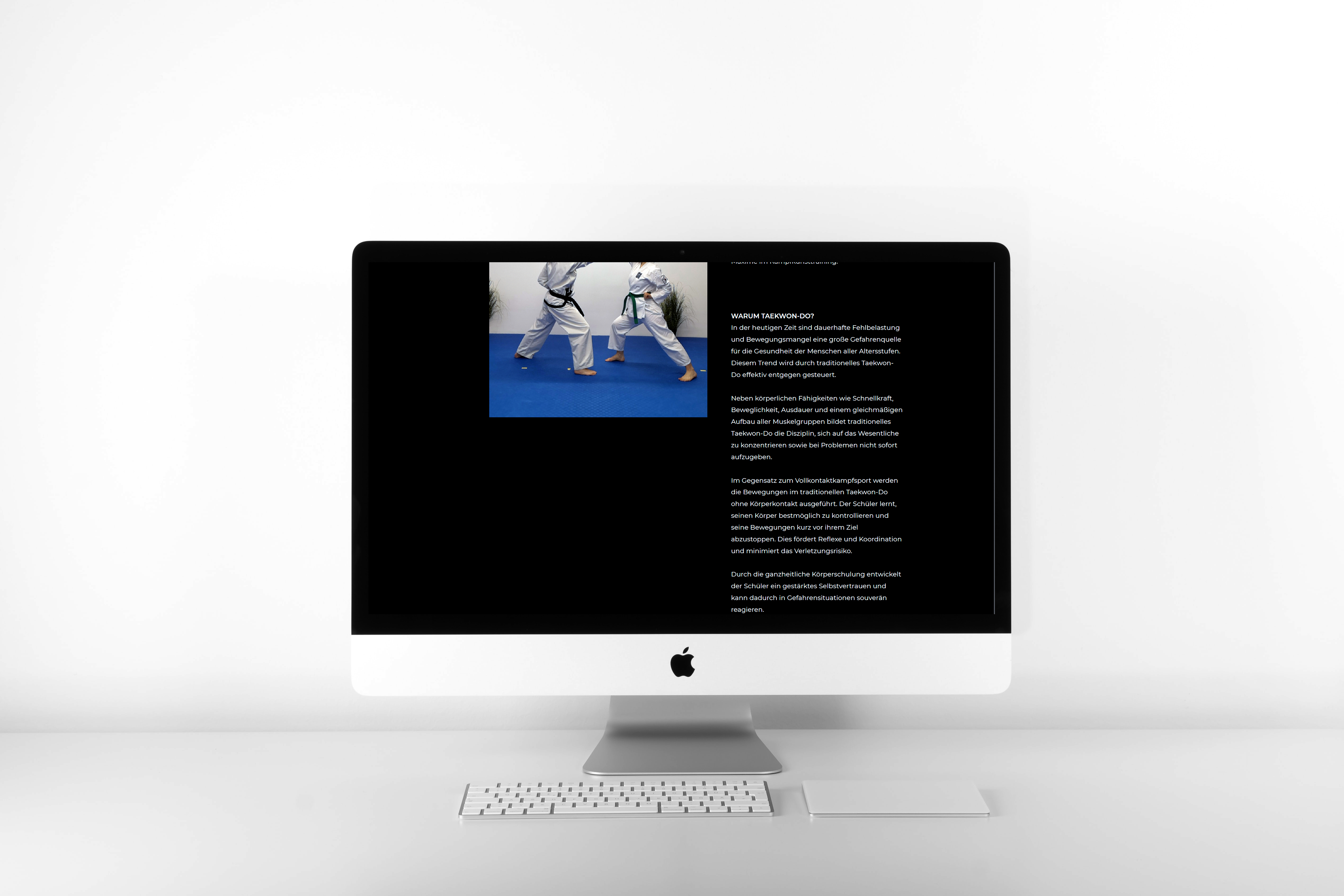
The Taekwondo-Zentrum Geisenfeld is a school for traditional Korean martial arts that has a welcoming and passionate community of athletes of all age groups.
Since the current website that can be found under www.taekwondo-geisenfeld.de, is currently dominated by grey colours and many menu links, the challenge was changing a lot in the structure and design.
In a new approach, this redesign of the Taekwondo-Zentrum Geisenfeld's website is meant to communicate sports, tradition, community and strength. The main goal is to capture people's interest for the traditional martial art while still being informative and simple.
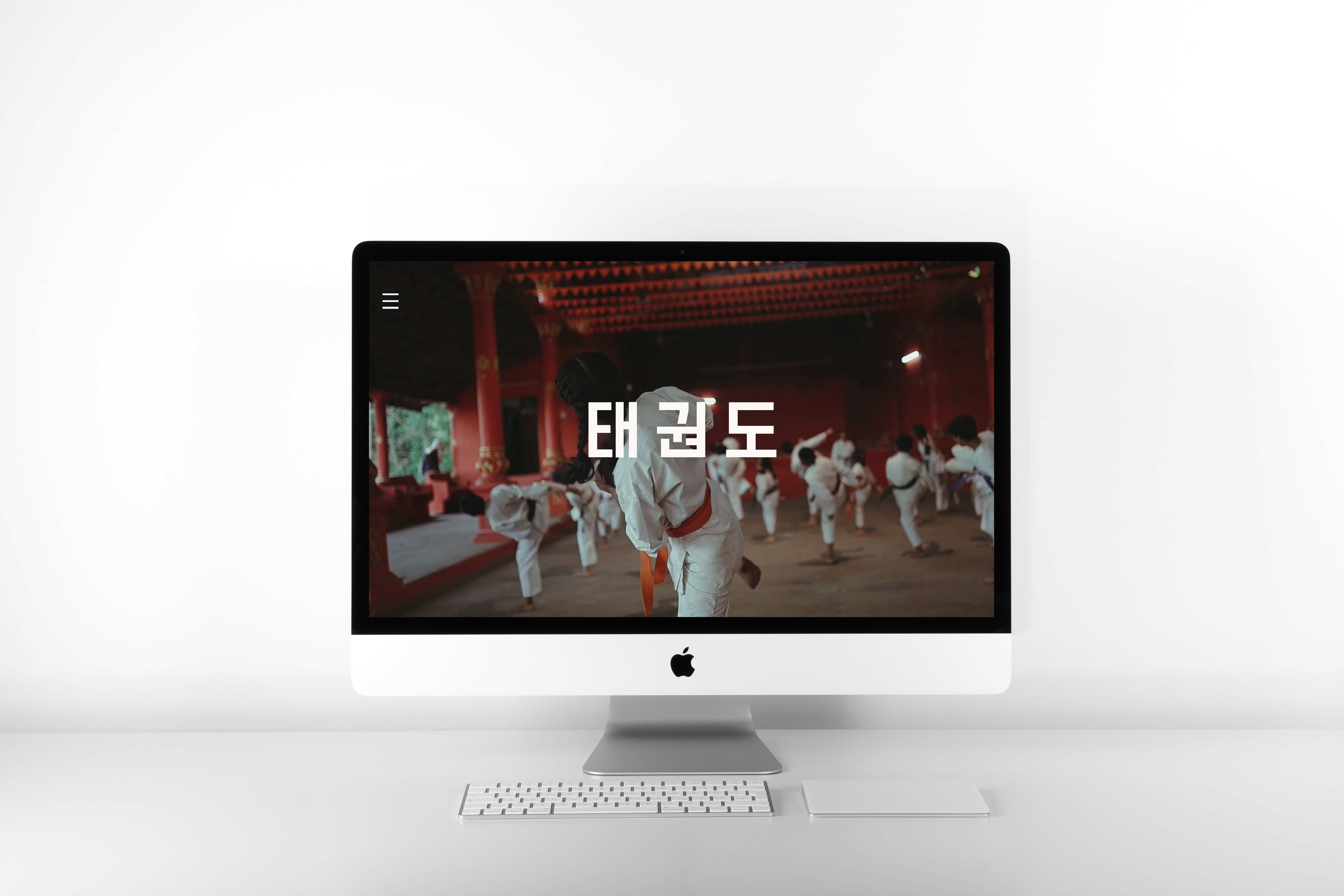
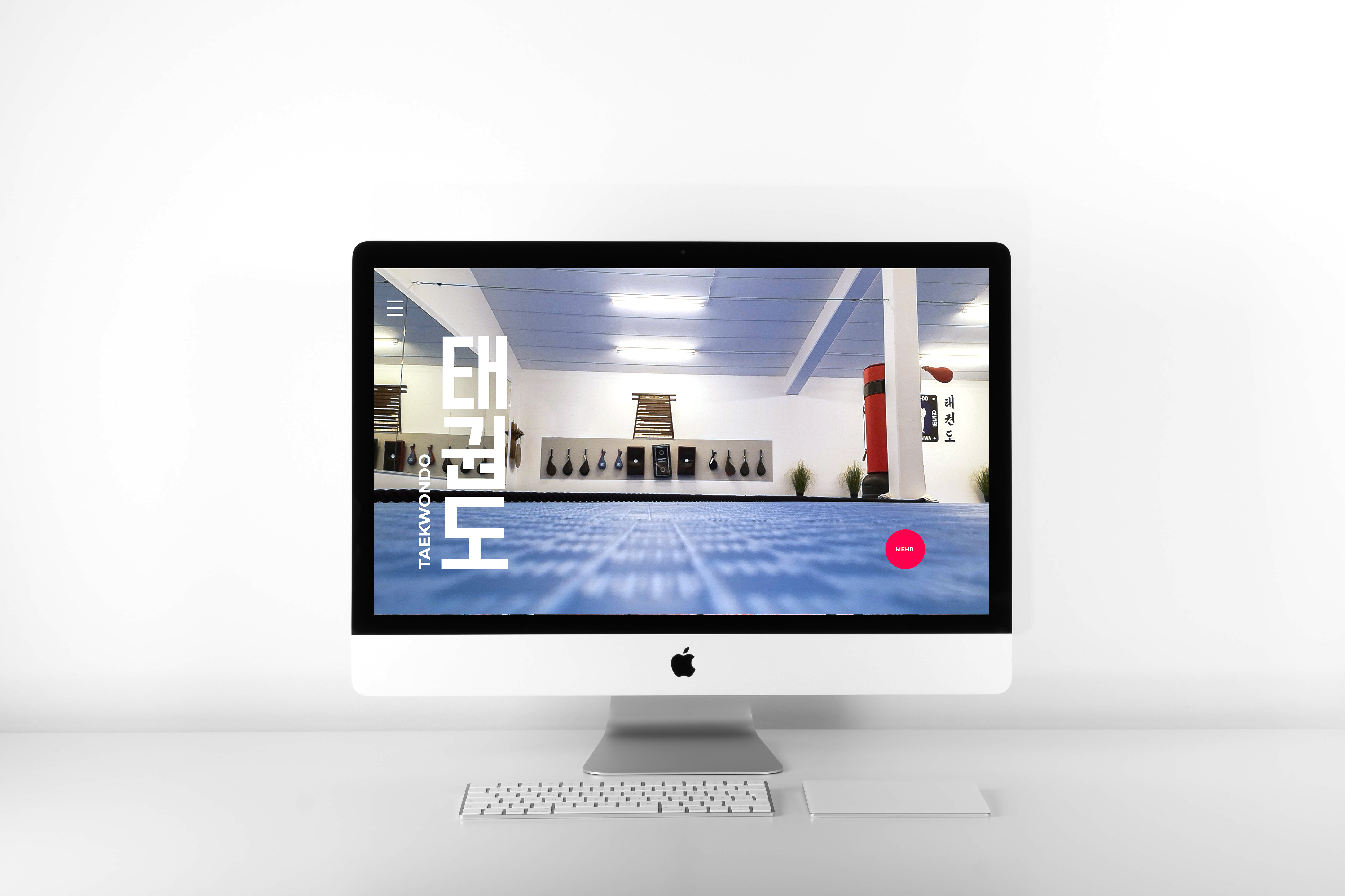
The landing page welcomes the visitor with a loop-video of different impressions, that can all be associated with Taekwondo.
Since Taekwondo is practiced not only as a sport but also a lifestyle, it is important to transport the correct vibrations. The use of stylistic Hangul strengthens the connection to Korea.
Full-screen images are used instead of much text.
Like that it is easy for the visitor to imagine what the sport and especially the training is like at the "Taekwondo-Zentrum Geisenfeld".
The pictures are meant to visualize energy, life and excite the visitor like that.
Typography is kept simple. It is important to not make information difficult to read.
That is also the reason for the new styling of the training times table. Typography alone creates structure for the user.
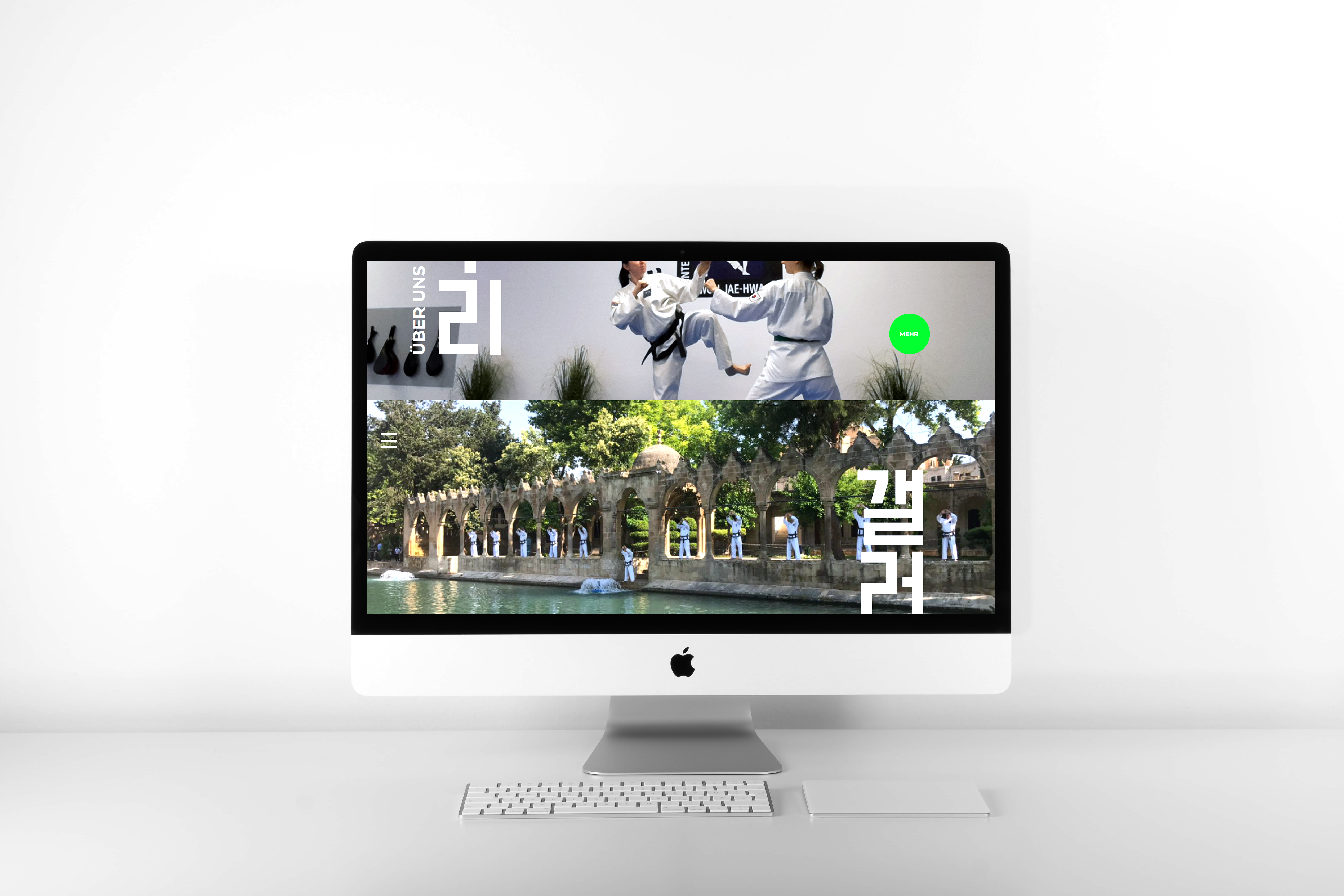
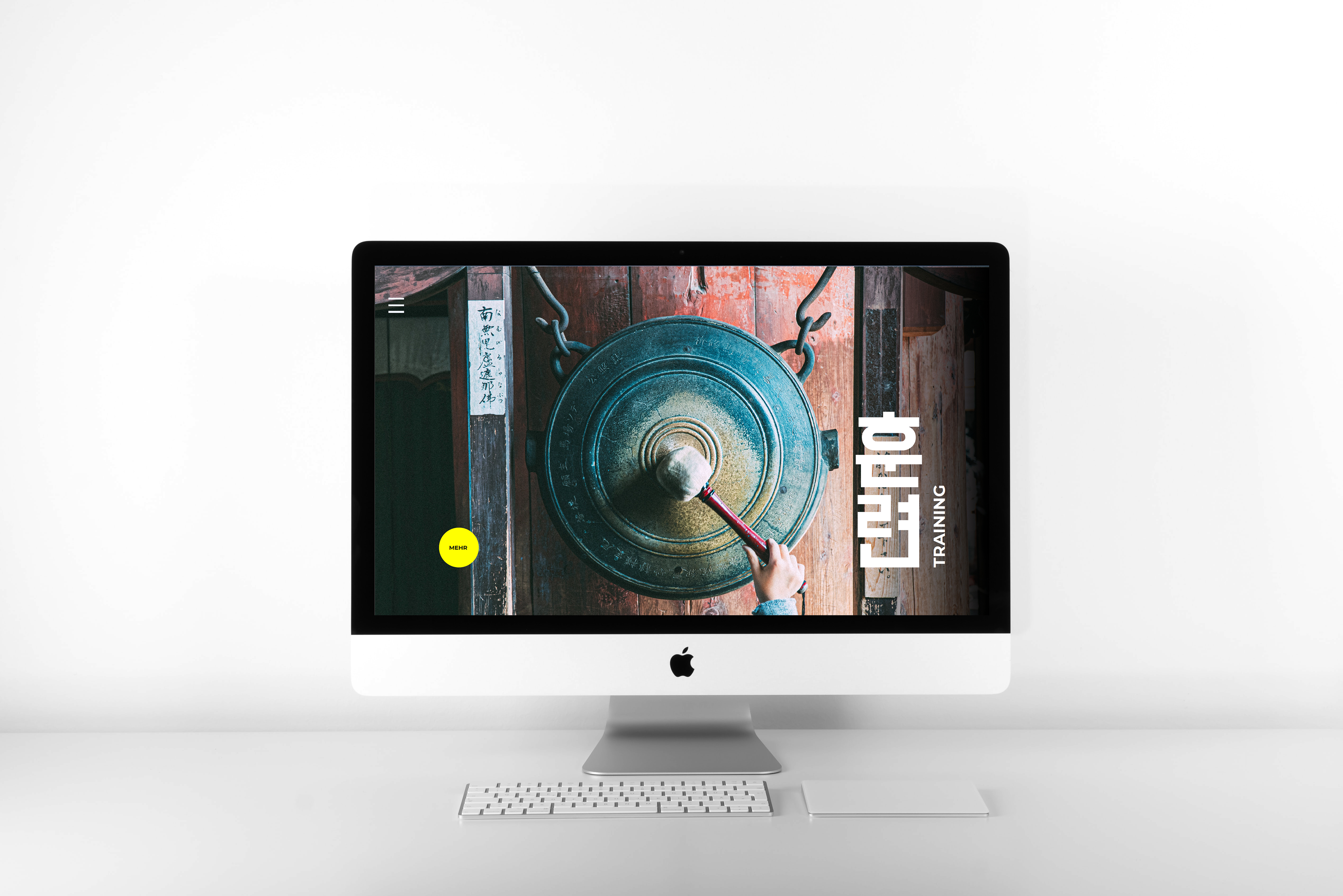
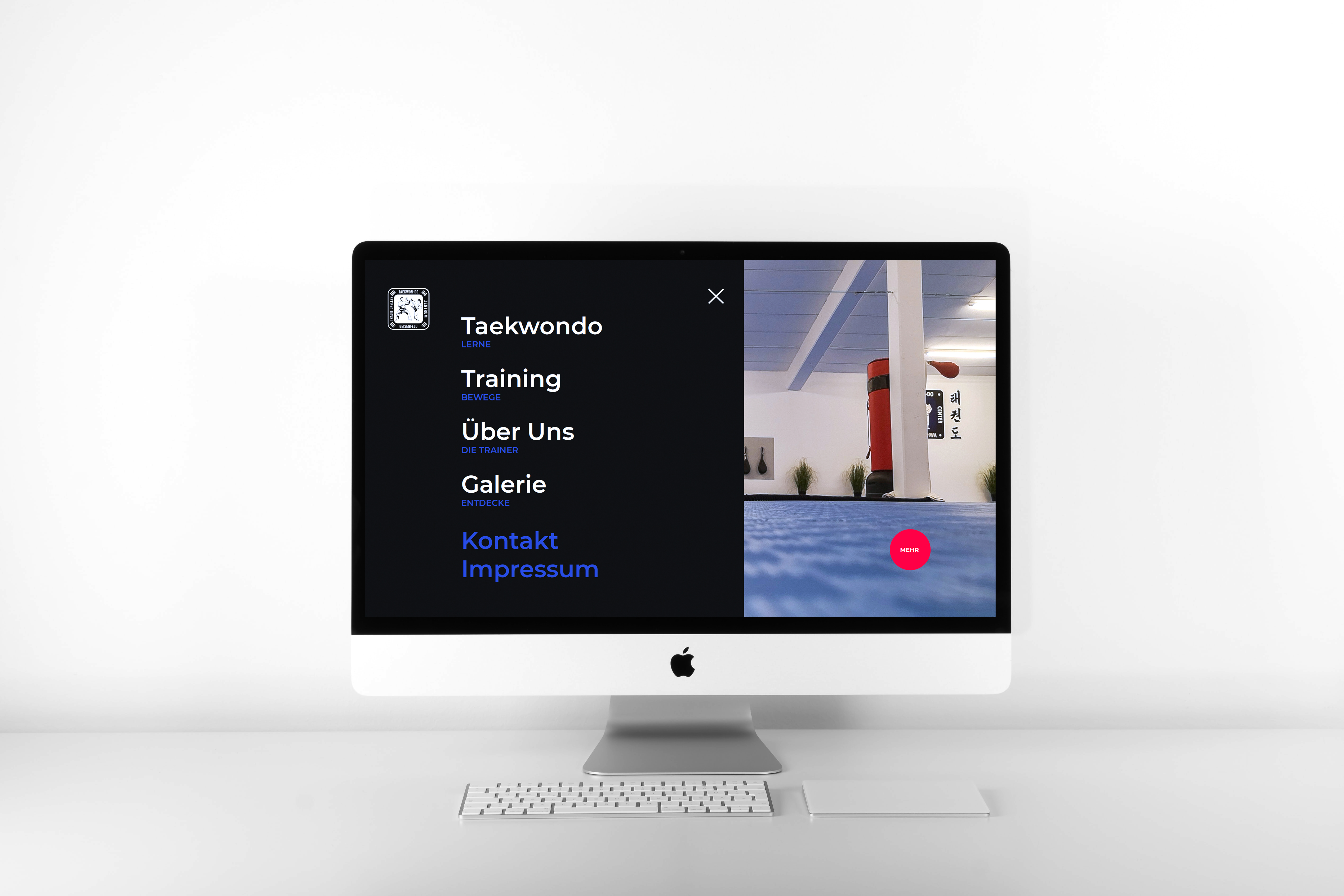
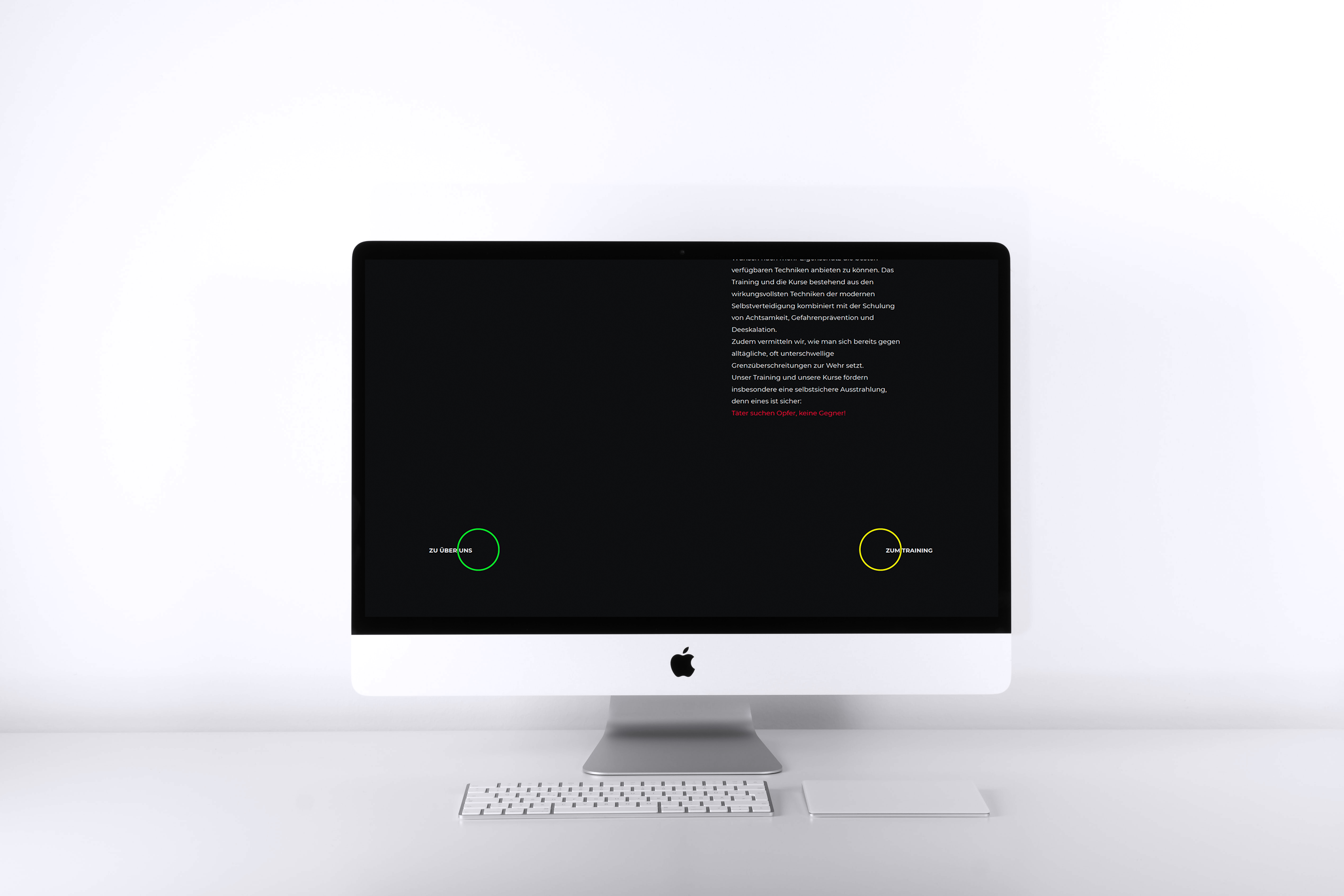
Round colorful buttons lead to subpages, that contain more specific information about each category.
In comparison to the old website, there are now only five main categories which are completely sufficient:
Taekwondo
Training
Über uns (About us)
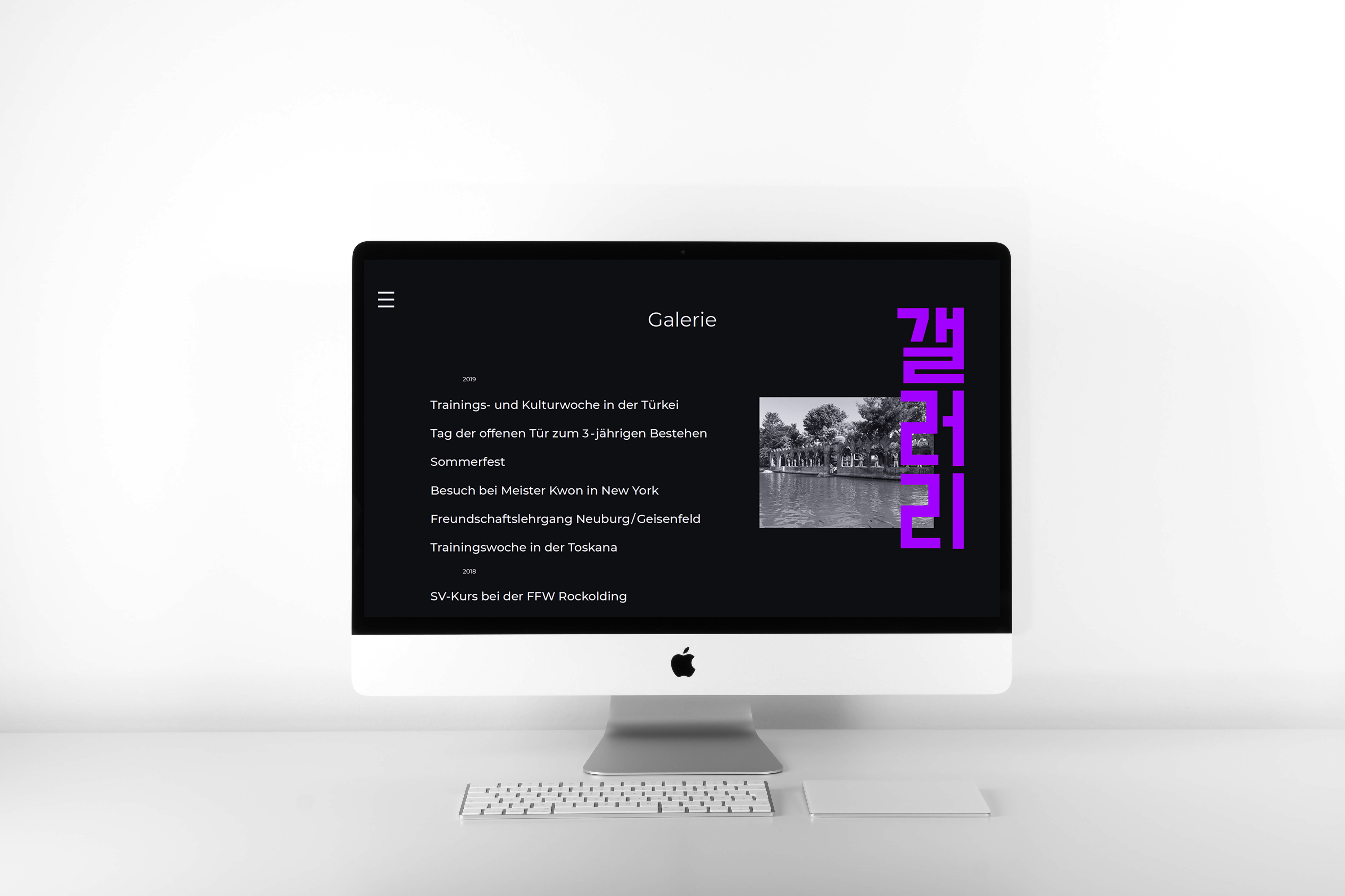
Galerie (Gallery)
The sub-categories can be reached via the menu as well, to ensure an easy user-experience. The overall layout of the website is kept dark to accentuate the images more. Each sub page uses the same colours that can be found on their teaser page. Like that the user knows which page they are currently exploring.
For many first time visitors prices are an important factor when considering joining a sports club. That is why they are included on the website as a new feature. The style is kept similar to the times table. To not create any confusion the paragraph is named in accentuating colors.
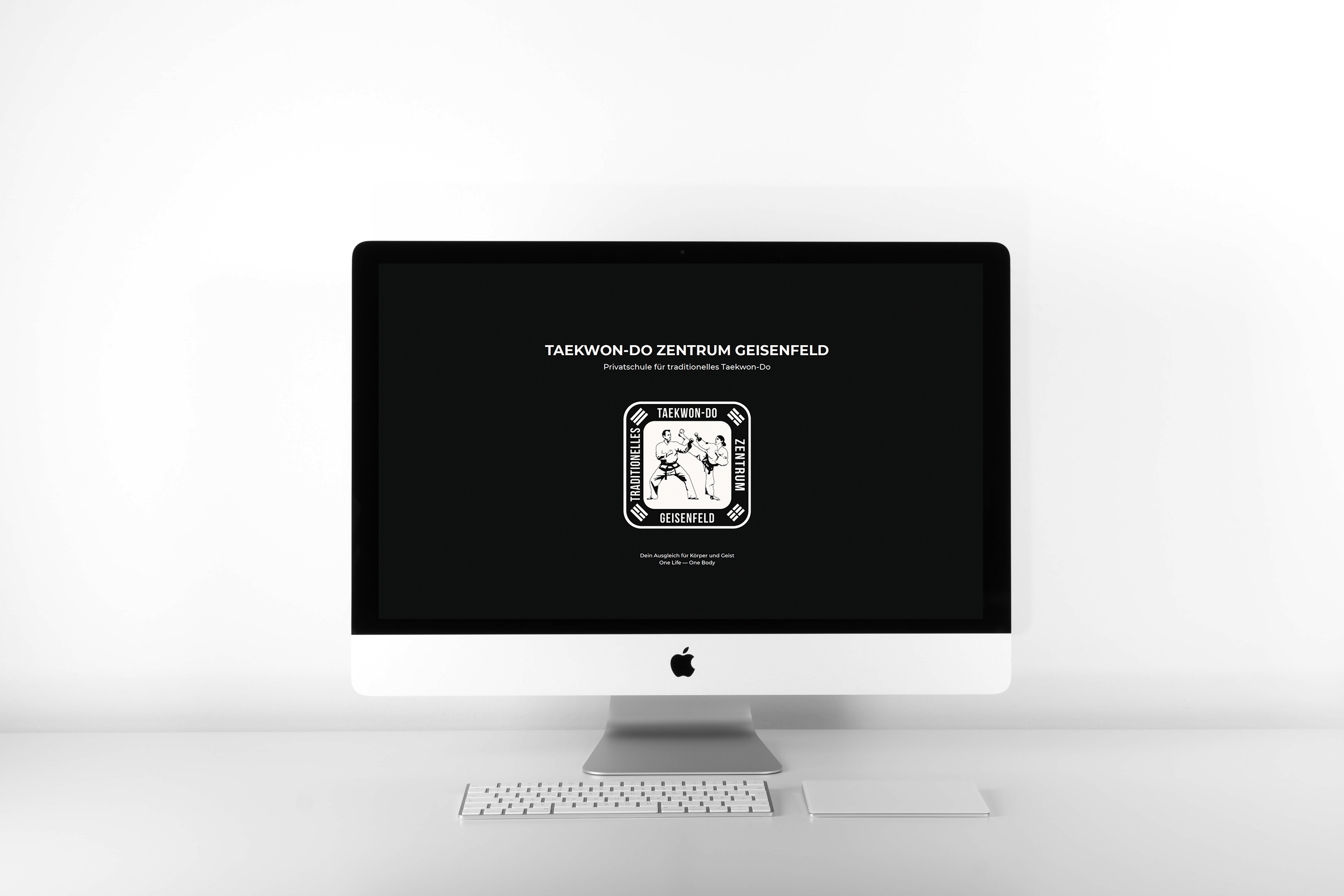
This very personal project was created together with Michaela Kappes.