The guidance concept book
for "Deutsches Museum Verkehrszentrum".
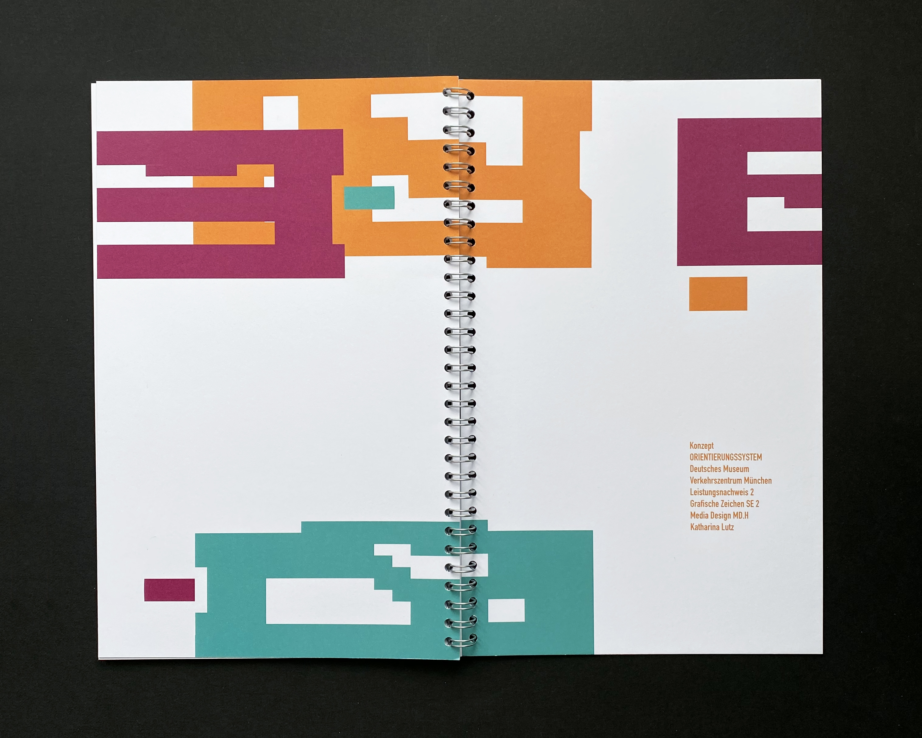
Since the "Deutsches Verkehrszentrum" (Museum of German traffic history in Munich) does not have a very cohesive system of orientation, the challenge was to develop a new wayfinding system for the exhibition that extends over three big halls.
The current situation is described in a book that functions as an analysis and style guide for the newly designed guidance system in one.
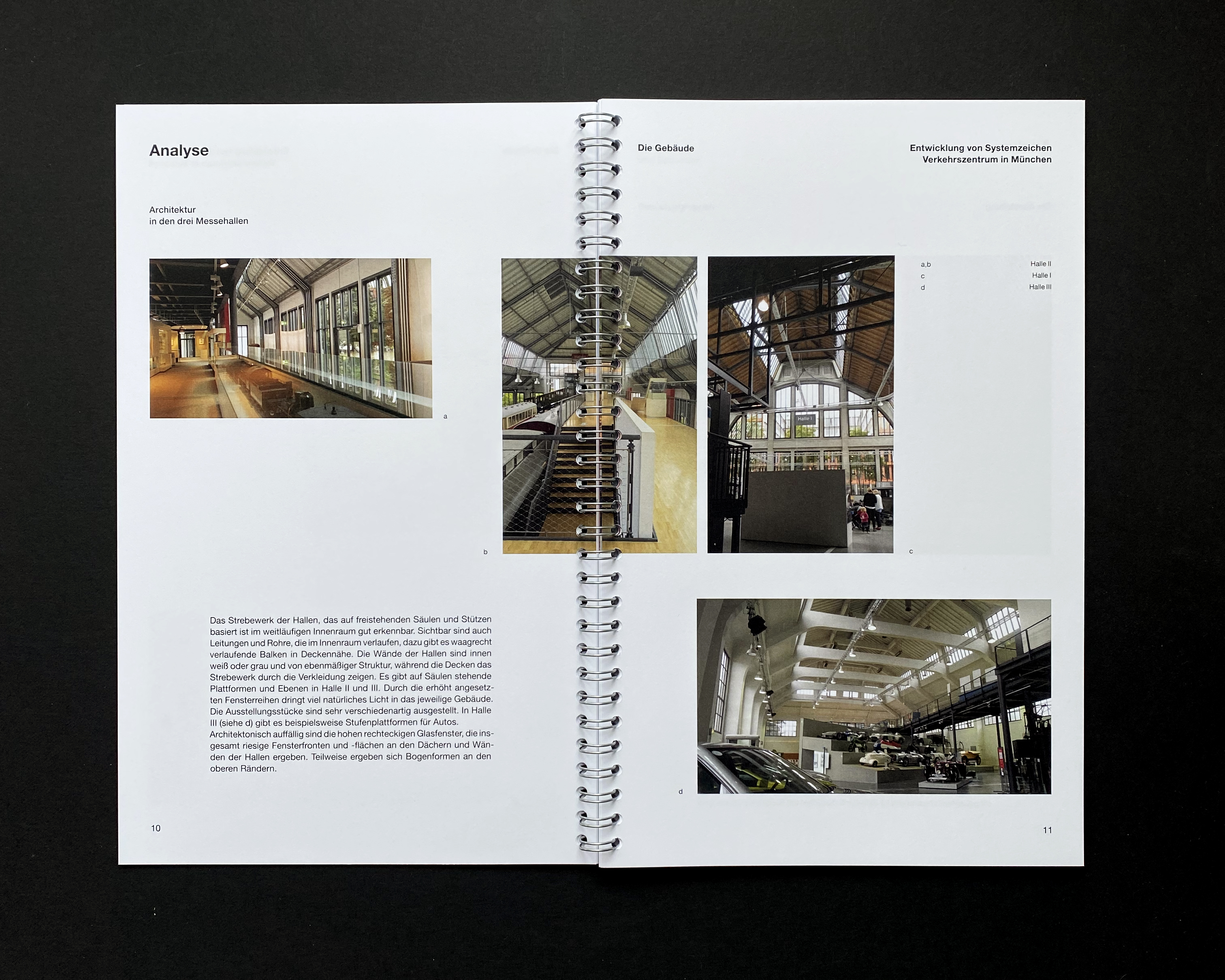
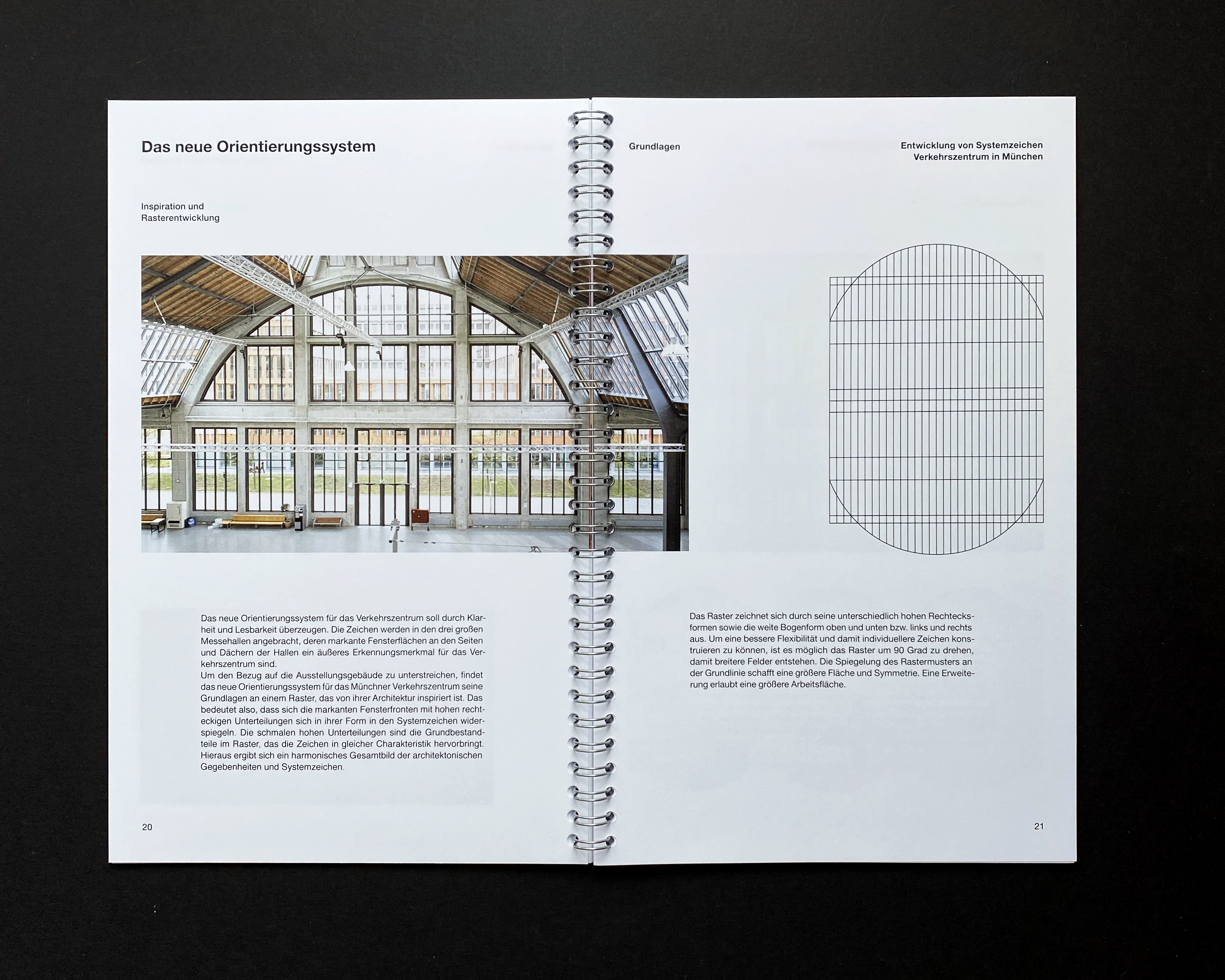
New pictograms are generated by using on the three halls' architecture, that shows characteristics of tall grid-like windows and buttresses as an inspiration.
To guarantee true consistency in style of the new wayfinding system, a grid becomes the base for all pictograms. Since the grid-system is created with the main building's front side in mind, the pictograms are abstract and tall in shape which makes them unique and extremely fitting for the buildings.
The grid makes maintaining a cohesive structure and therefore easier orientation for visitors, since the character of all symbols stays the same.
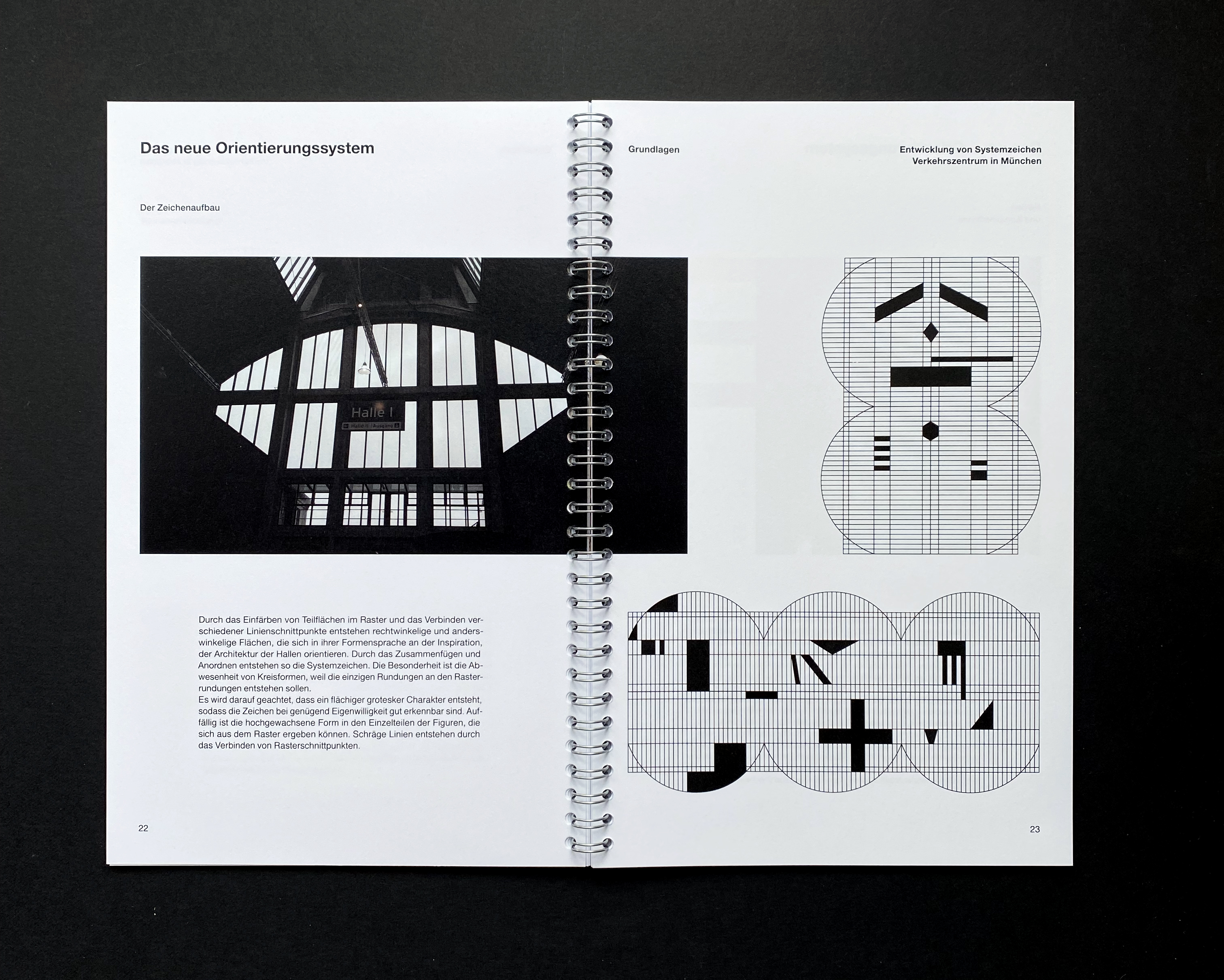
Experiments with shapes inside the grid-system demonstrate the different ways in which points of intersection can be connected to create the resulting pictograms. The book demonstrates allowed shapes for the new wayfinding system.
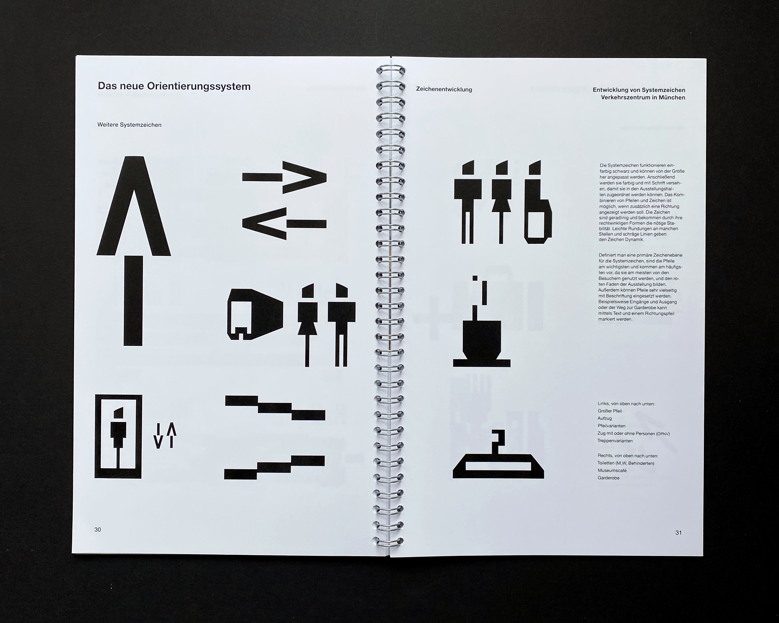
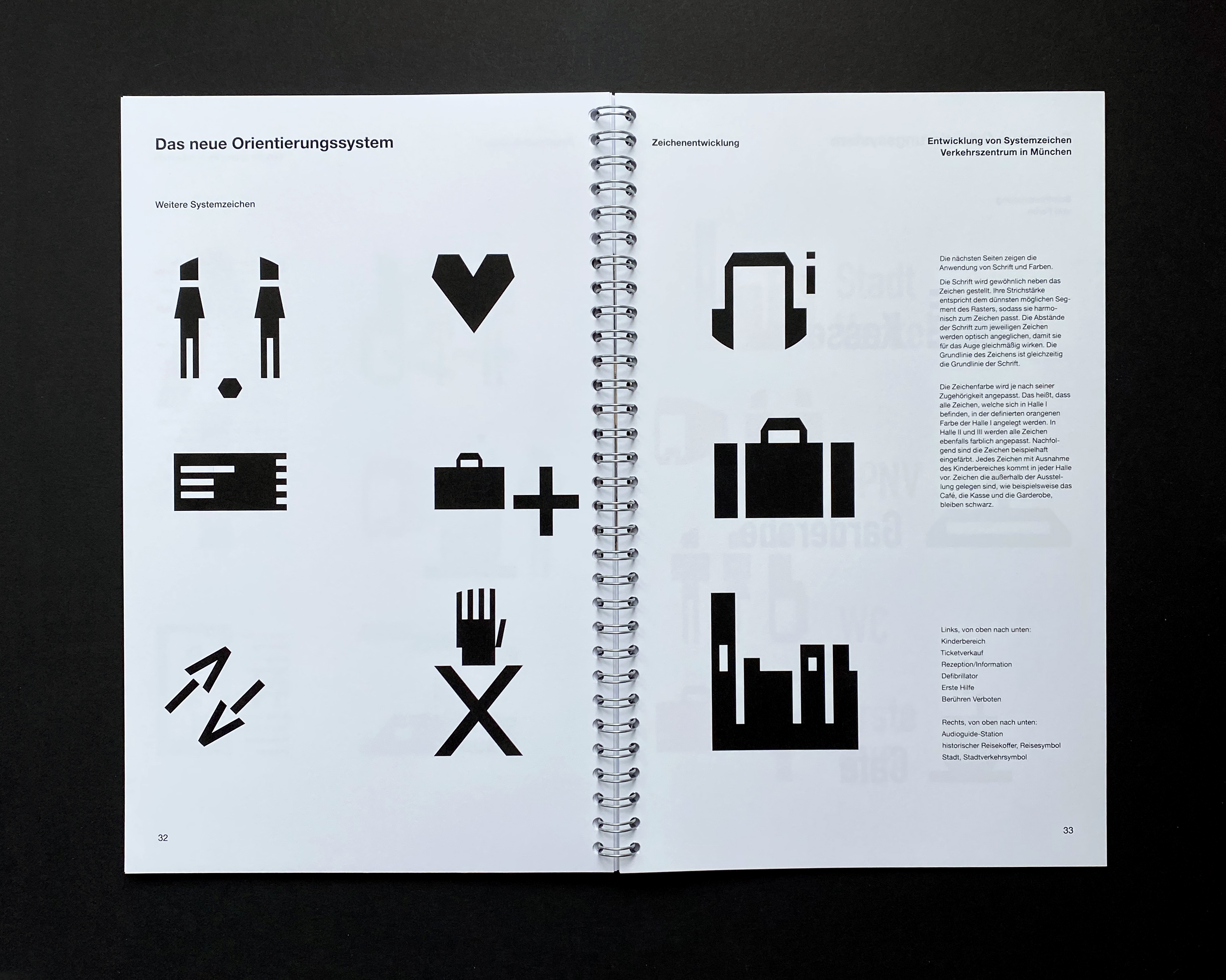
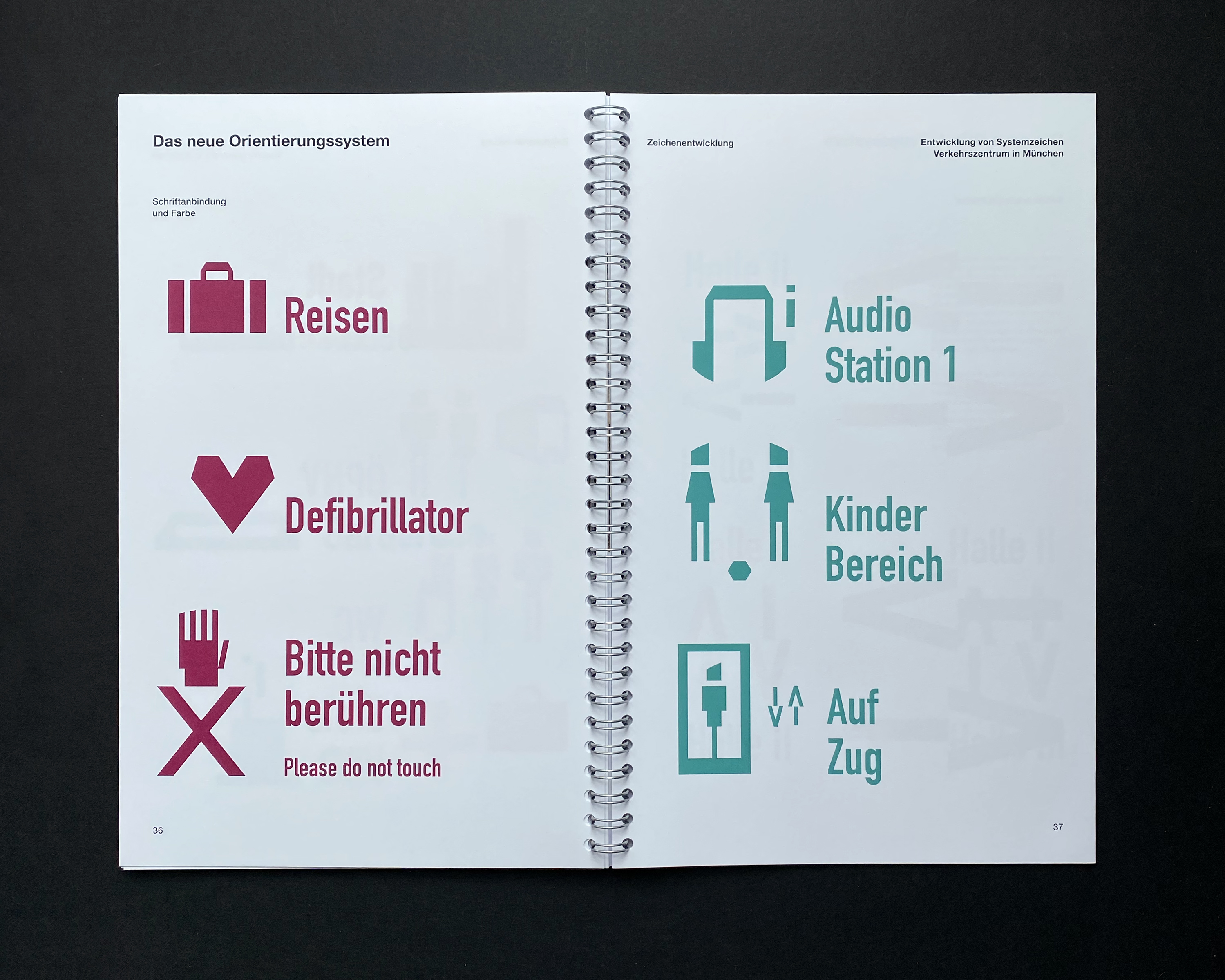
Lastly several experiments lead to essential pictograms: arrows, elevator, toilets (female, male, suitable for the disabled), café and more. Specialities that are centered around the topic of traffic can be found in signs that stand for public transportation, cities or travelling.
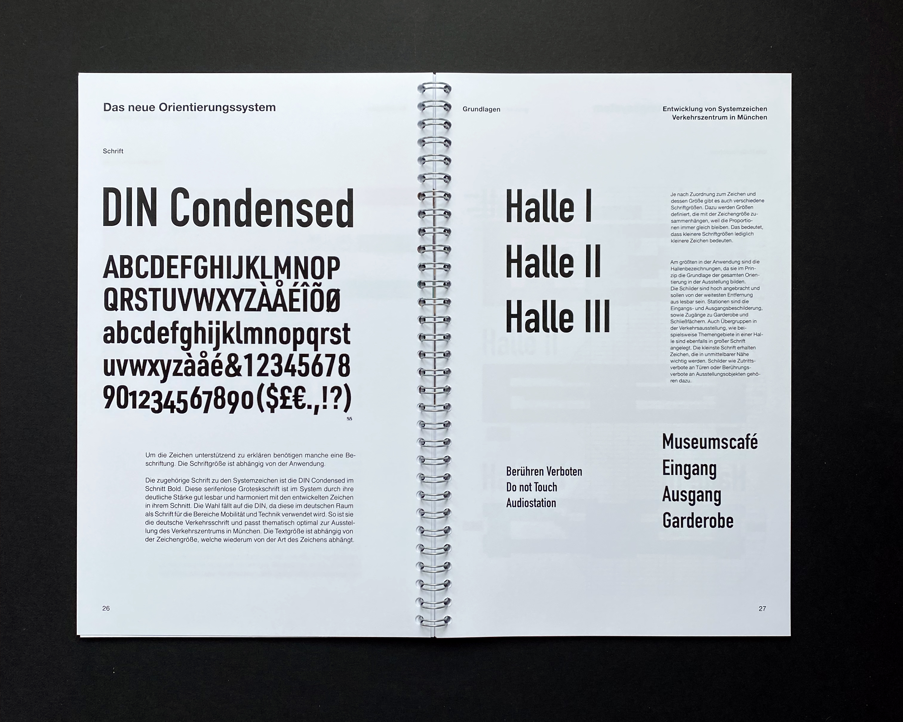
It is important to combine certain pictograms with text to make them especially clear. That is why the chosen "DIN Condensed" is added to the symbols where needed. The font harmonizes with the tall and slender shapes of the pictograms and is the official font of Germany's traffic and signs altogether which makes it connect to the museum's theme.
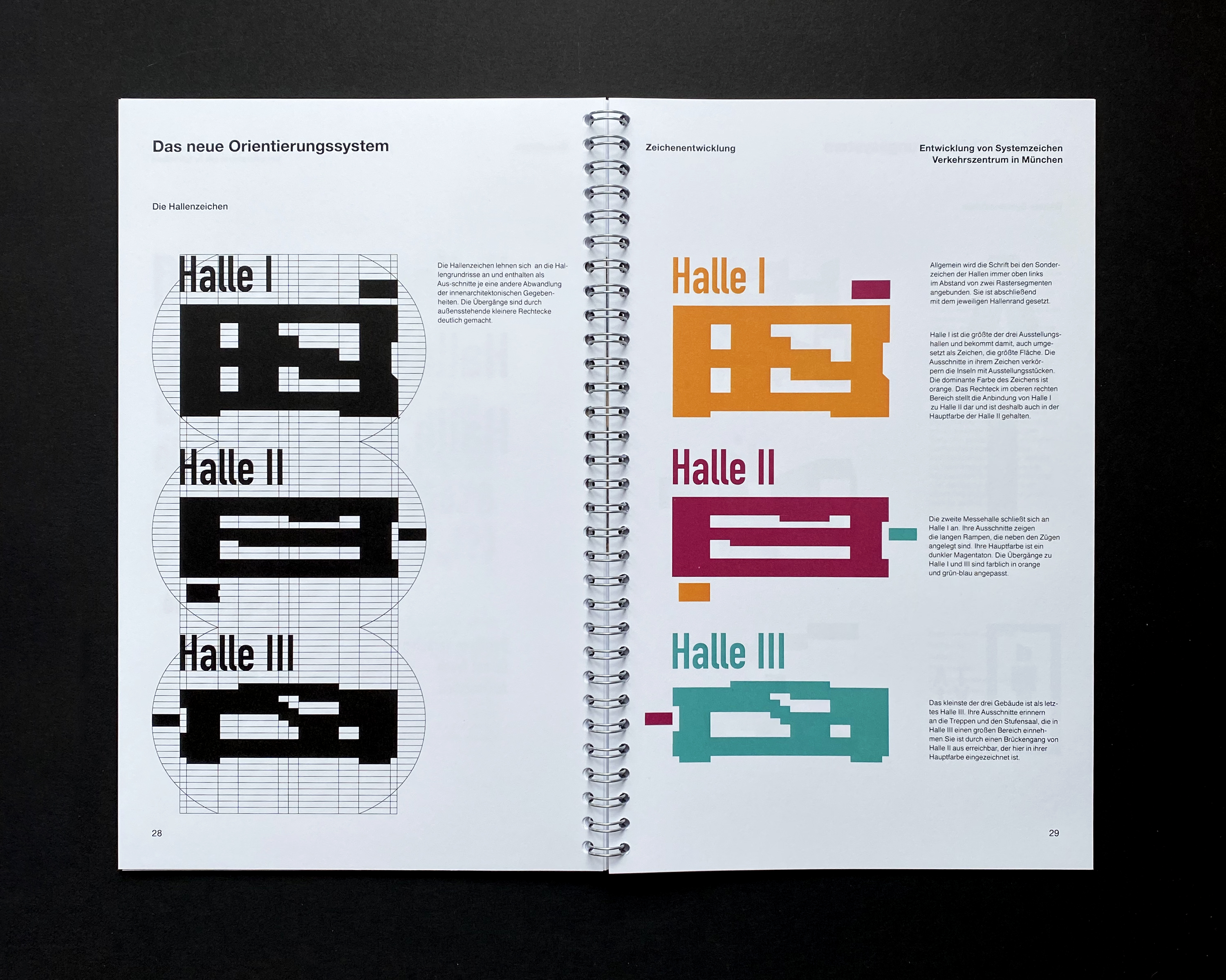
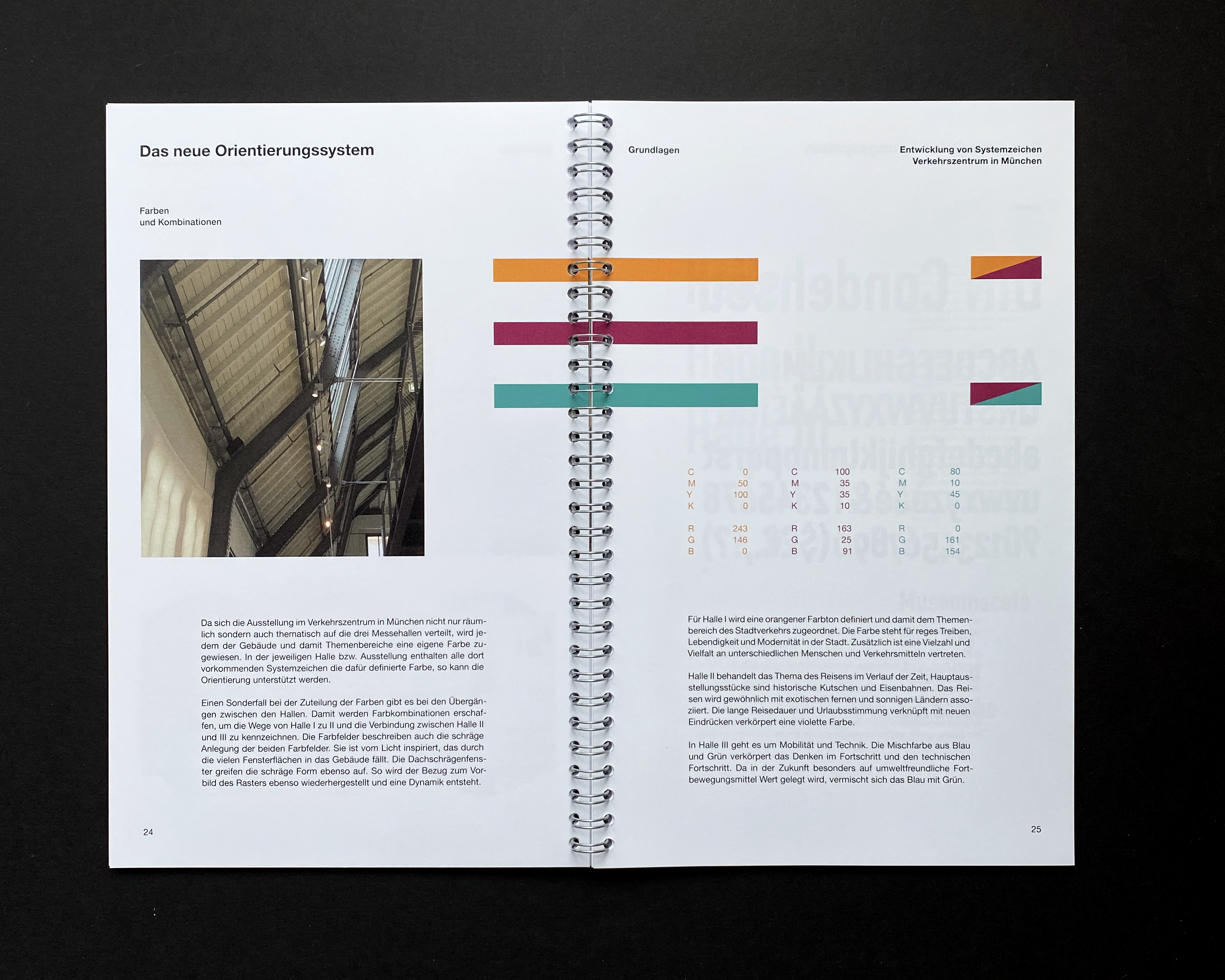
When it comes to colour, each of the three individual halls is assigned a certain colour that is chosen according to the main topic of each hall's exhibition.
Since the museum is extensive, each hall is translated into a simple pictogram as well, which can later be used on a flyer's map for example.
These symbols find their form based on the same grid-system like the other pictograms while adopting the real rectangular shape of each building. The cutouts in each hall's symbol resemble the inner architectural structures of the halls. To use the third hall as an example, its pictogram is distinguishable from the other two halls' by its long floating platform, staircase and audience room.
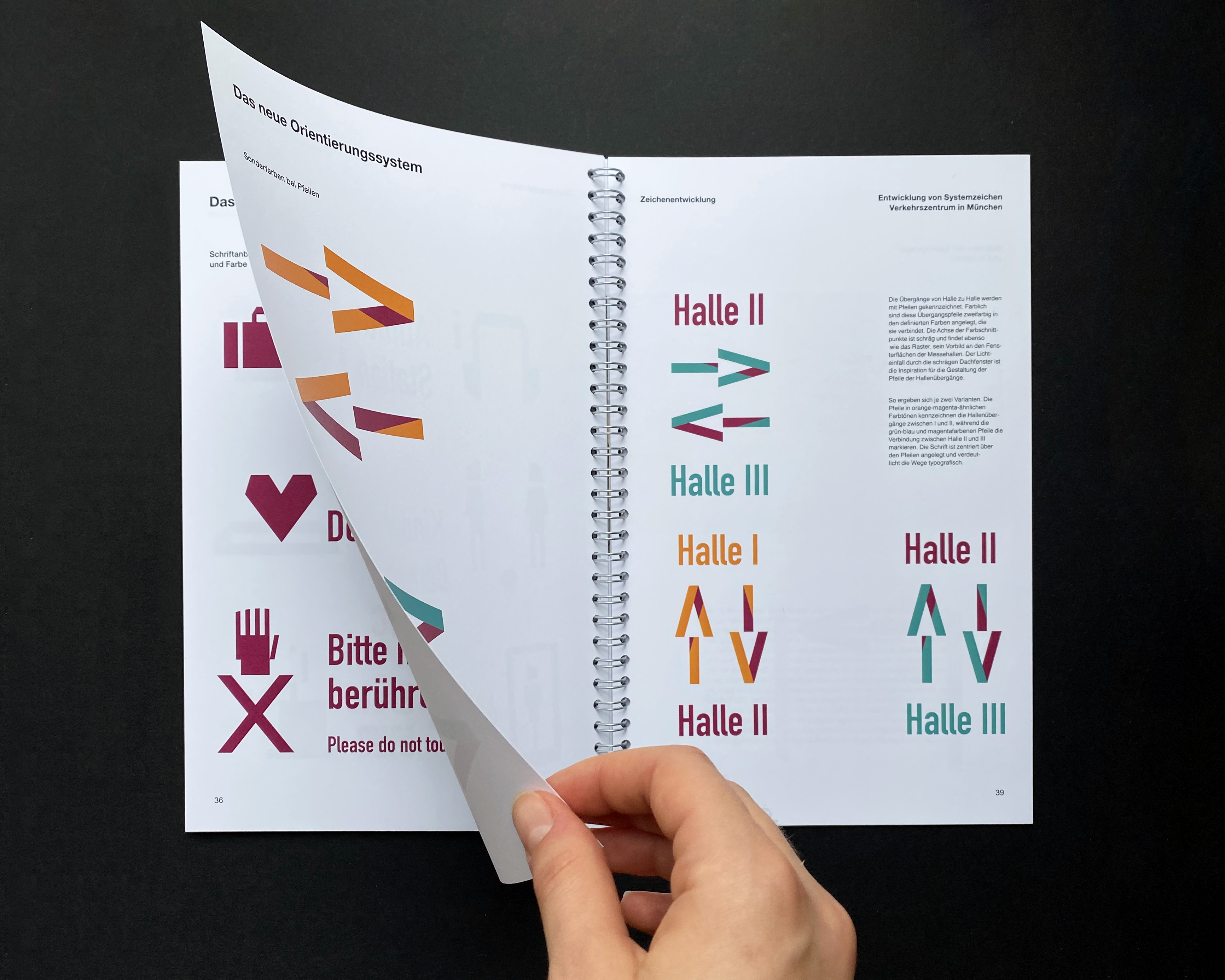
The three halls are connected by corridors that guide the visitor towards the next part of the exhibition. In the pictograms they are labeled in the colour of the hall that they lead to which makes it simpler for the visitor to understand how each hall can be reached.
All signs in each hall are presented in the appointed colour to ensure an easier orientation for the visitor by communicating the current location through their colour.
The first hall gets assigned an orange colour that is supposed to represent the liveliness and modernism in city traffic.
The center of attention in the second hall belongs to travelling and its history. That is why a darker magenta is chosen to embody new experiences, the duration and time as well as exotic foreign countries.
Lastly, a color that can be best described as a mixture of green and blue is found in hall number three. The main topic here is mobility and technologies concerning traffic in the future. The colour is supposed to be associated with velocity and sustainability.
A speciality in the colour scheme can be found with arrows symbolizing the corridors or passages between halls. The colours are used accordingly and create diagonal shapes which enable the colours of two halls to be combined in one symbol. The diagonal borders are based on the grid-system as well and generate a dynamic character which matches the topic of traffic and movement.
They are inspired by the architecture, more specifically the windows on the roof of each hall which allow — placed at an angle — diagonal rays of light to reach the museum's interior area.
The sizes for the new symbols are set to three different sizes. The biggest size is assigned to the hall's names (hall 1, hall 2, hall 3) since they are hung high in the center of the roof.
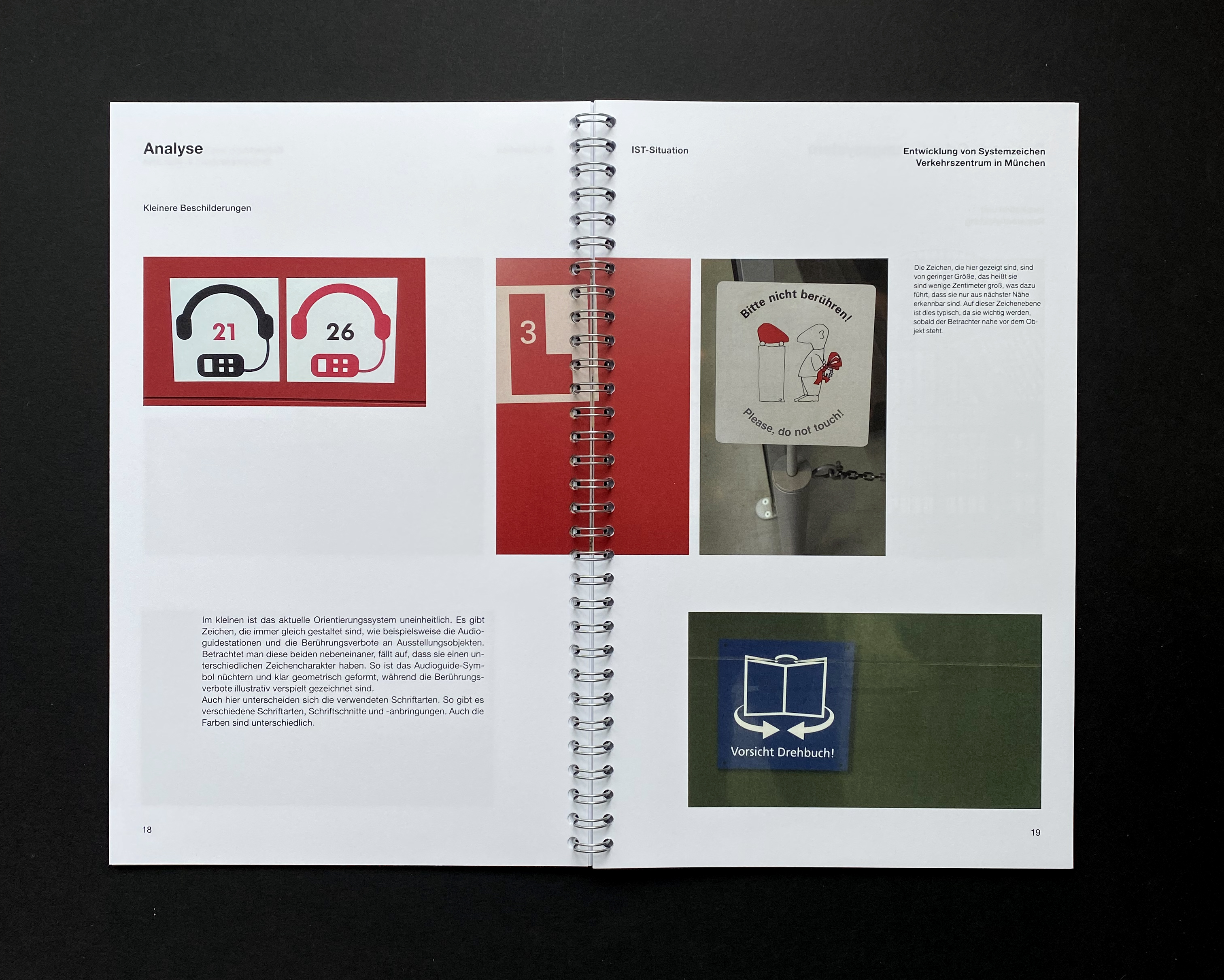
Middle sized symbols are found where smaller location inside the halls need to be appointed. They would be found higher than eye level which is why they need to be big enough to be seen from a distance as well. Examples would be toilets or the wardrobe.
The third and smallest size is chosen for pictograms that are directly linked to an object that is part of the exhibition. They are usually lower than eye level or on eye level. Typical for the museum you would find signs that prohibit touching objects or imply an audio guide station.
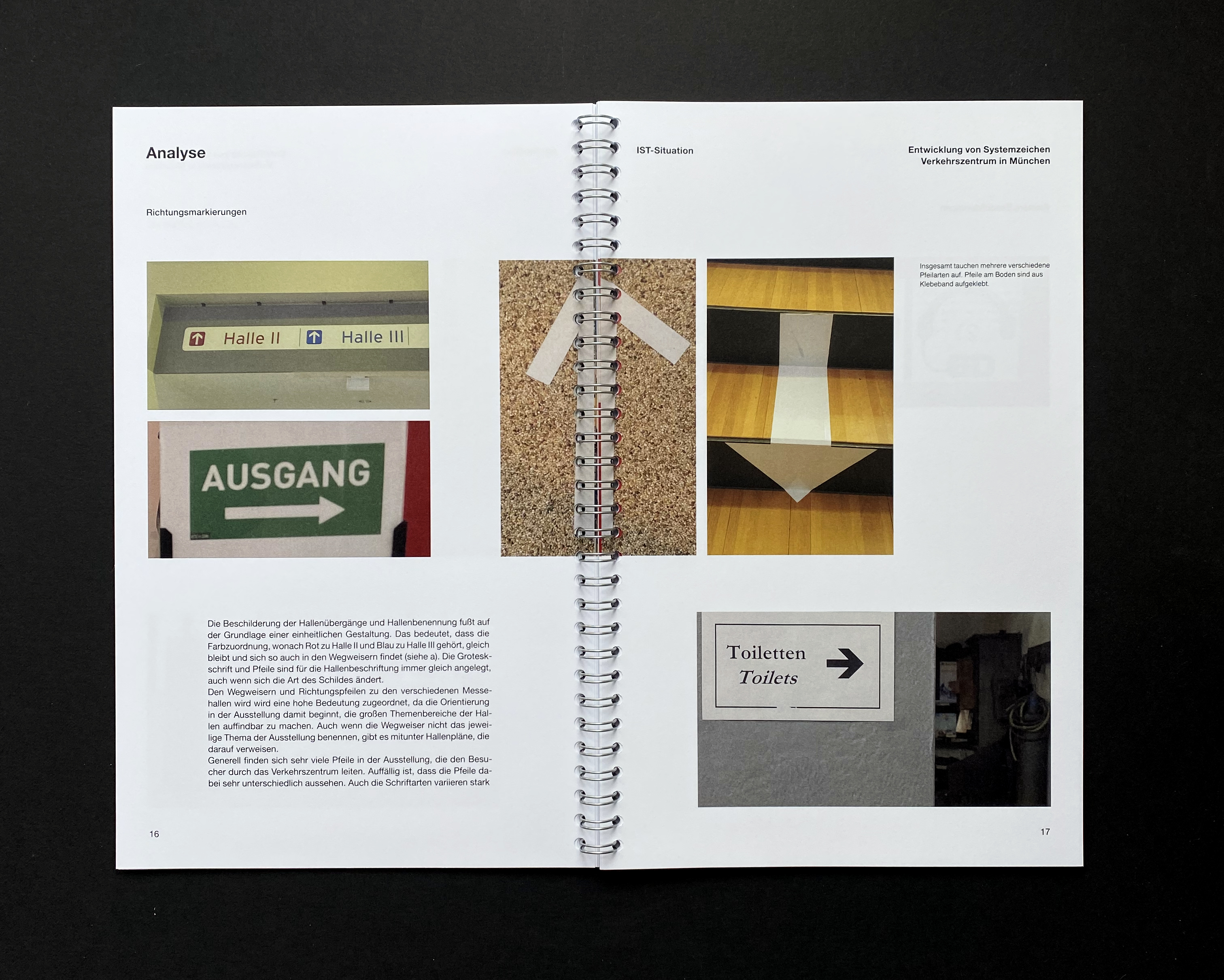
Arrows that help visitors find their way through the exhibitions can be found on the floor or walls to not distract from any objects.
To get a better understanding of the museum's current situation and area, a personal visit of the exhibition was essential and lead to the resulting wayfinding concept.