The informative flyer
for a painter's exhibition.
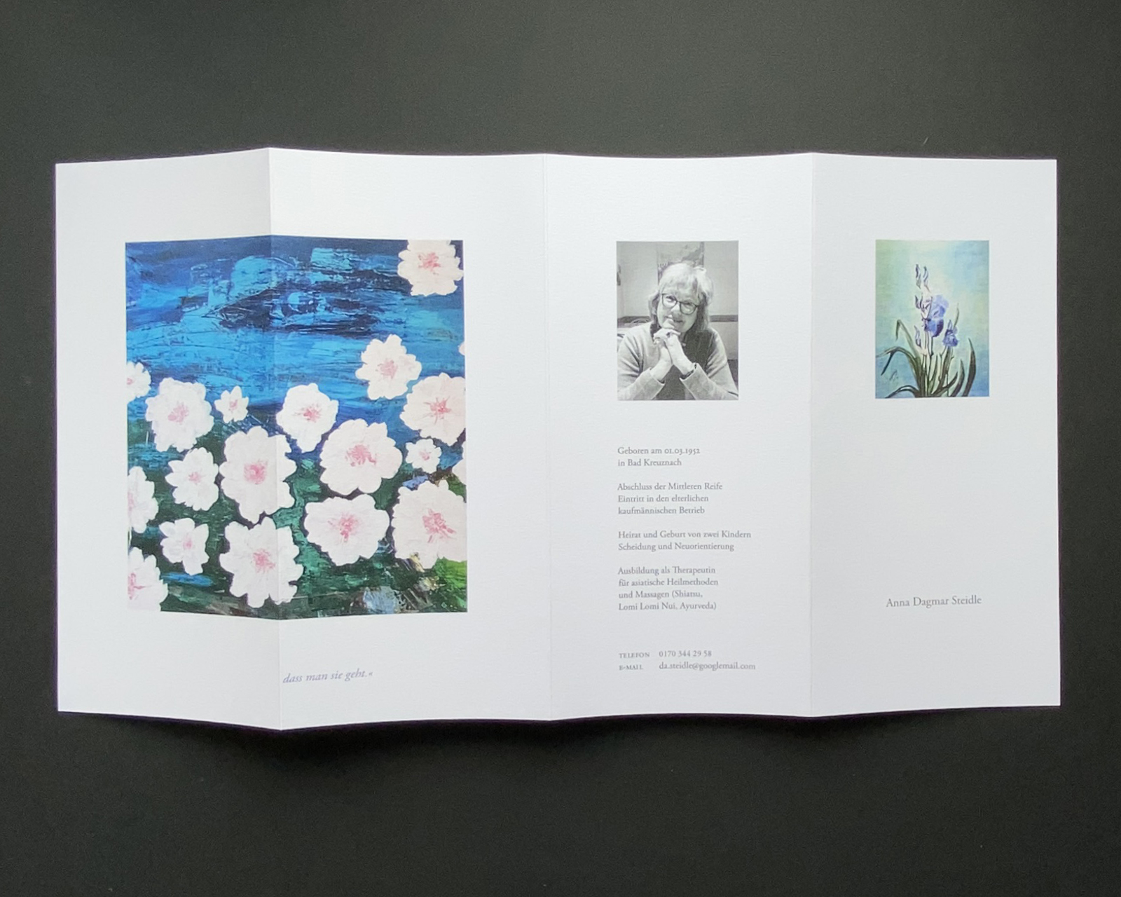
Dagmar Anna Steidle is a painter from Germany. Some of her paintings can be found in Europe, Southfrica and the US, where she has travelled multiple times.
Her inspiration comes from the beauty of nature and life experience. She finds beauty in every creation. A flyer or booklet should be created for a planned exhibition of her work.
"The joy of painting runs through my life like a red thread."
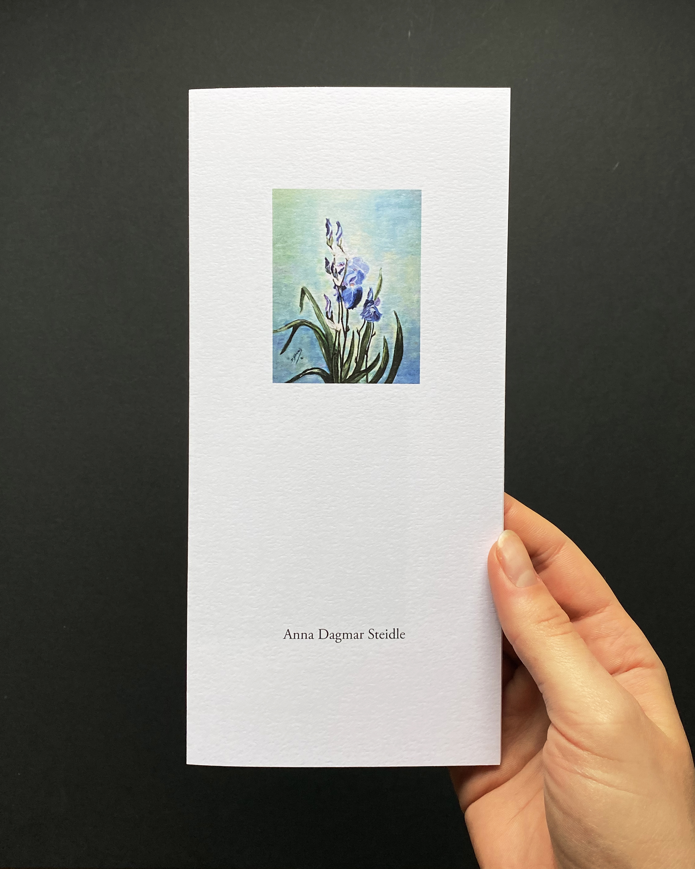
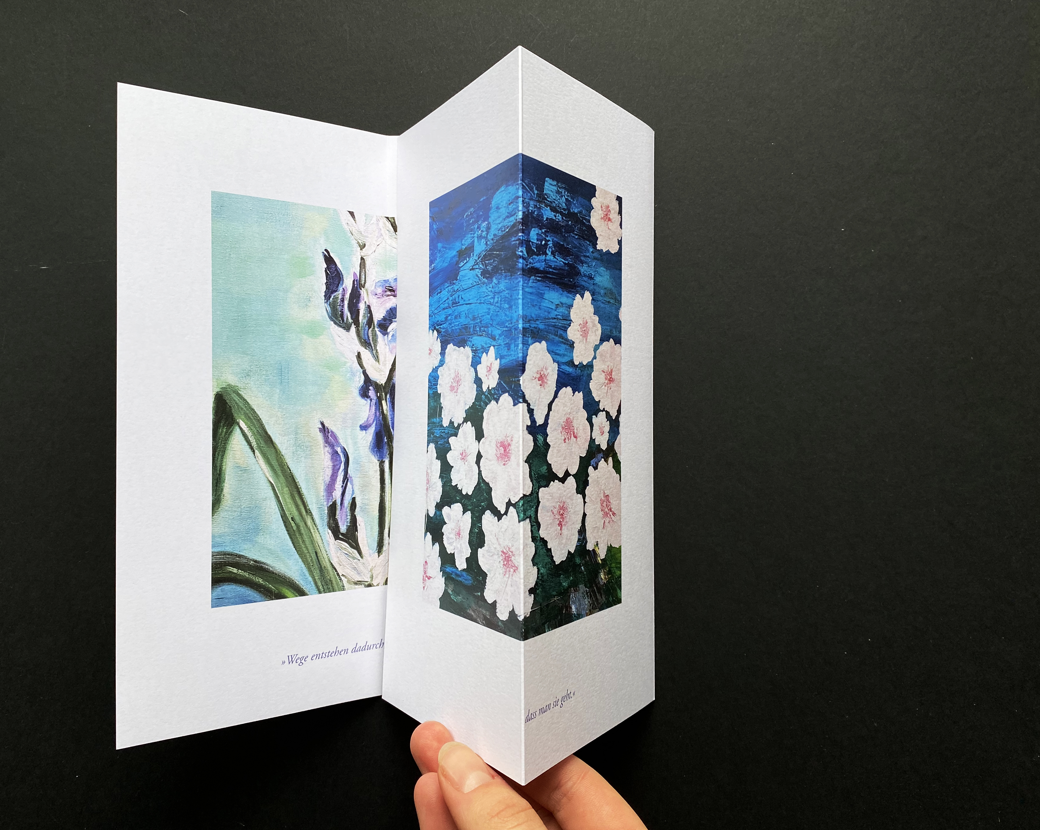
The exhibition includes many of her paintings of flowers which is why elements of those can be found on the flyer.
Since the client is a calm and gentle personality — like her paintings — the overall design was kept simple and classic in style.
A variant of the typeface Garamond is used to accompany the pictures in a quiet way and sets the focus onto the painter's work.
To keep the order and not distract, text is cohesively placed on the images' baselines.
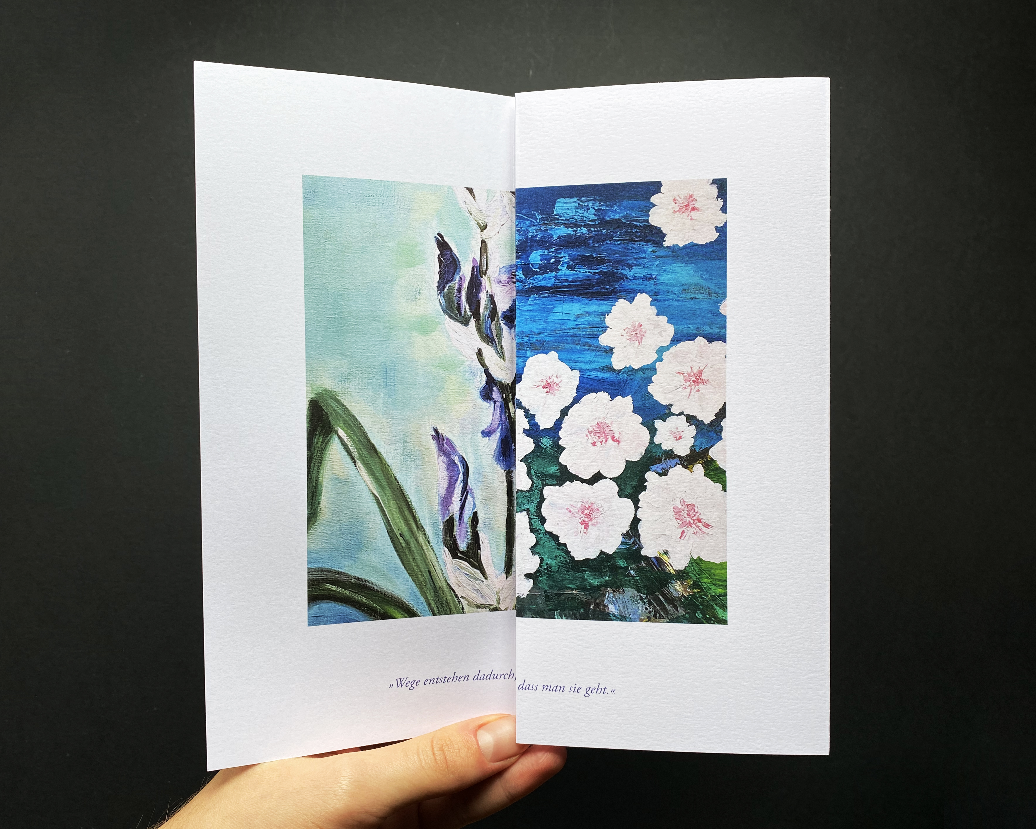
An exception to that can be found on the first inner, and last outer page that both come together in a quote and two different images.
Anna Dagmar Steidle's life is shaped by many experiences that go into many directions and make her the person that she is today. Everything in life has multiple facettes and at least two sides, and we never know what time brings to us.
The two different images imply that there is more to her paintings just like in life. There is always a deeper meaning or a second outlook on things. The viewer is motivated to indulge in deeper thoughts.
"Paths are created by walking them."
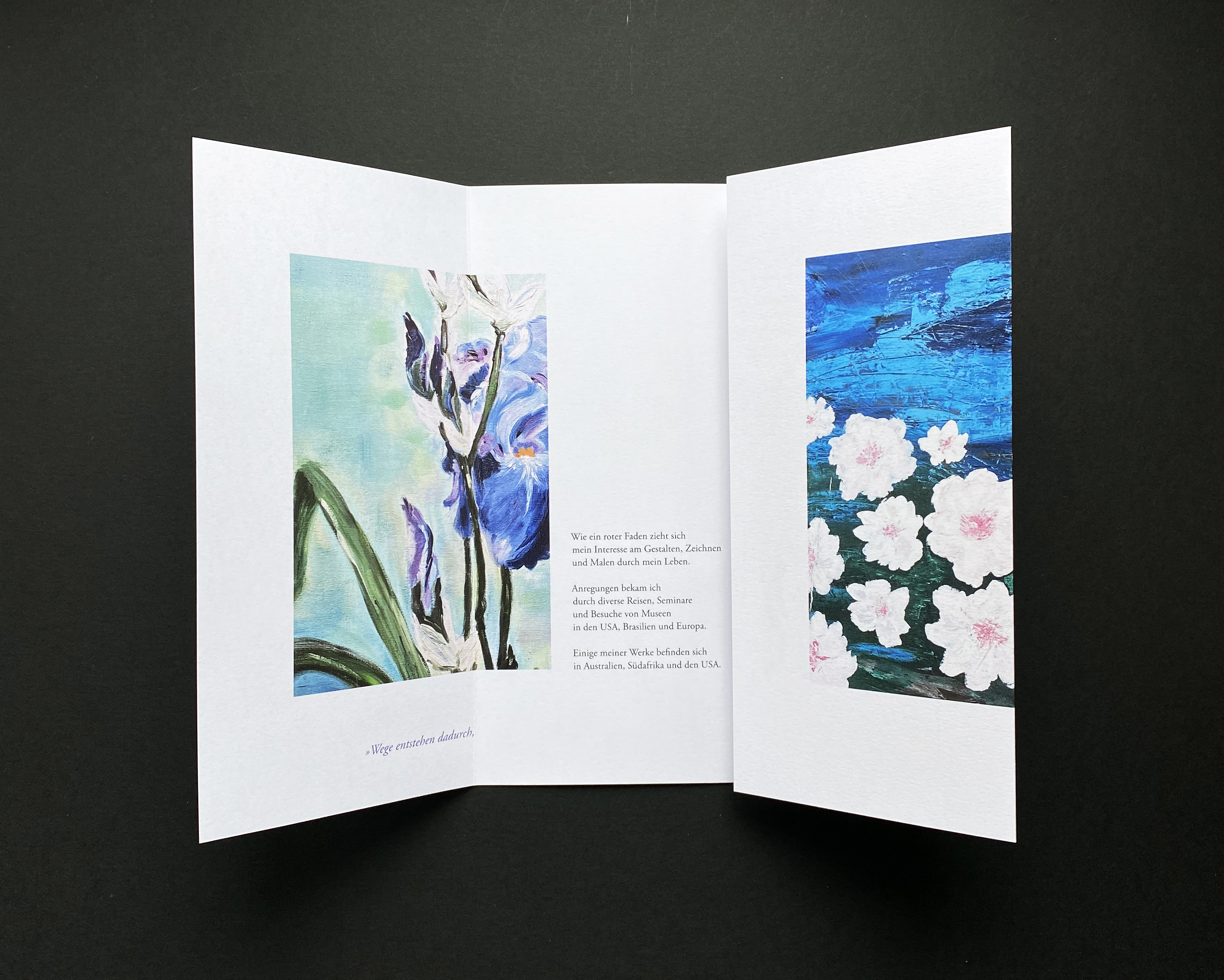
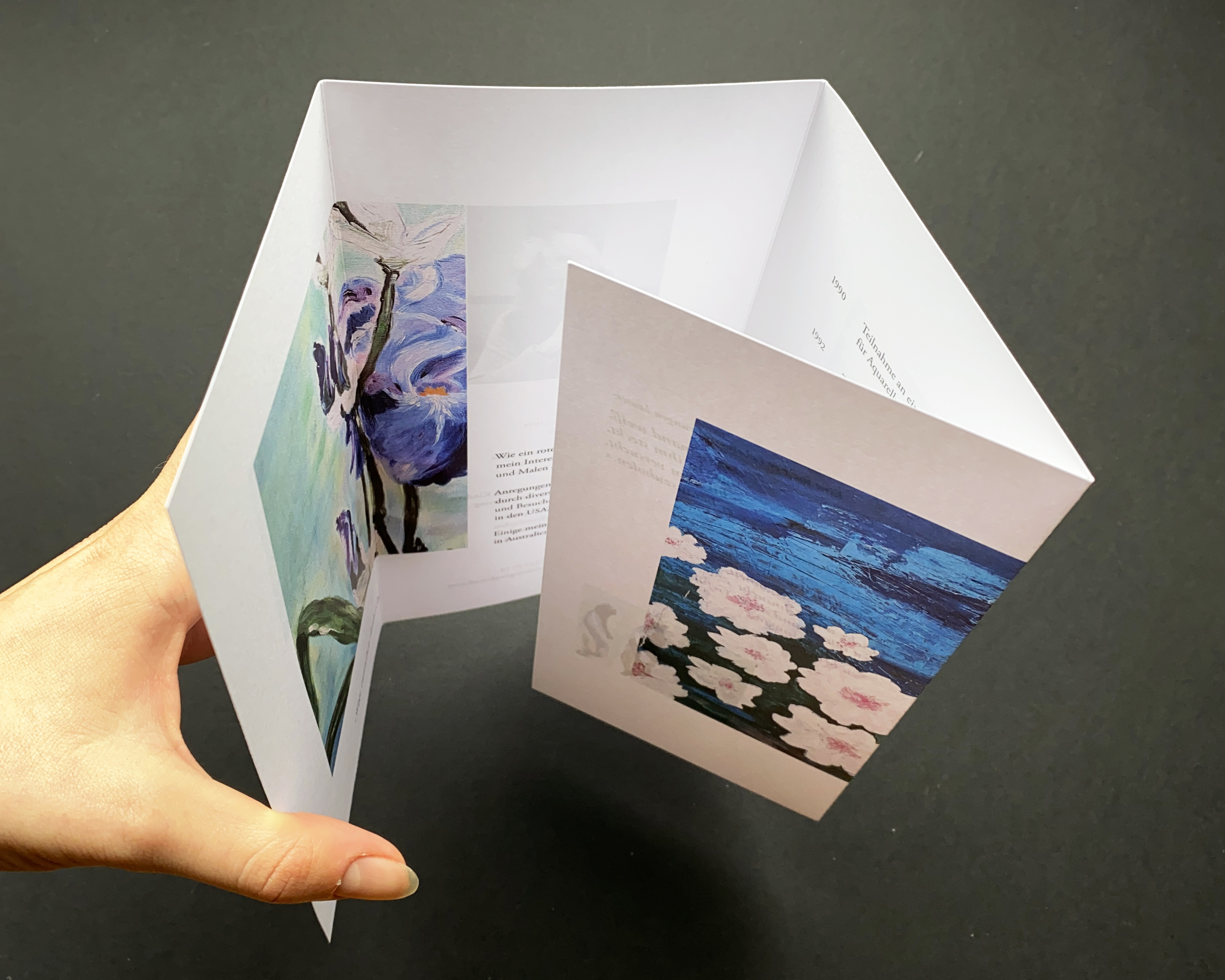
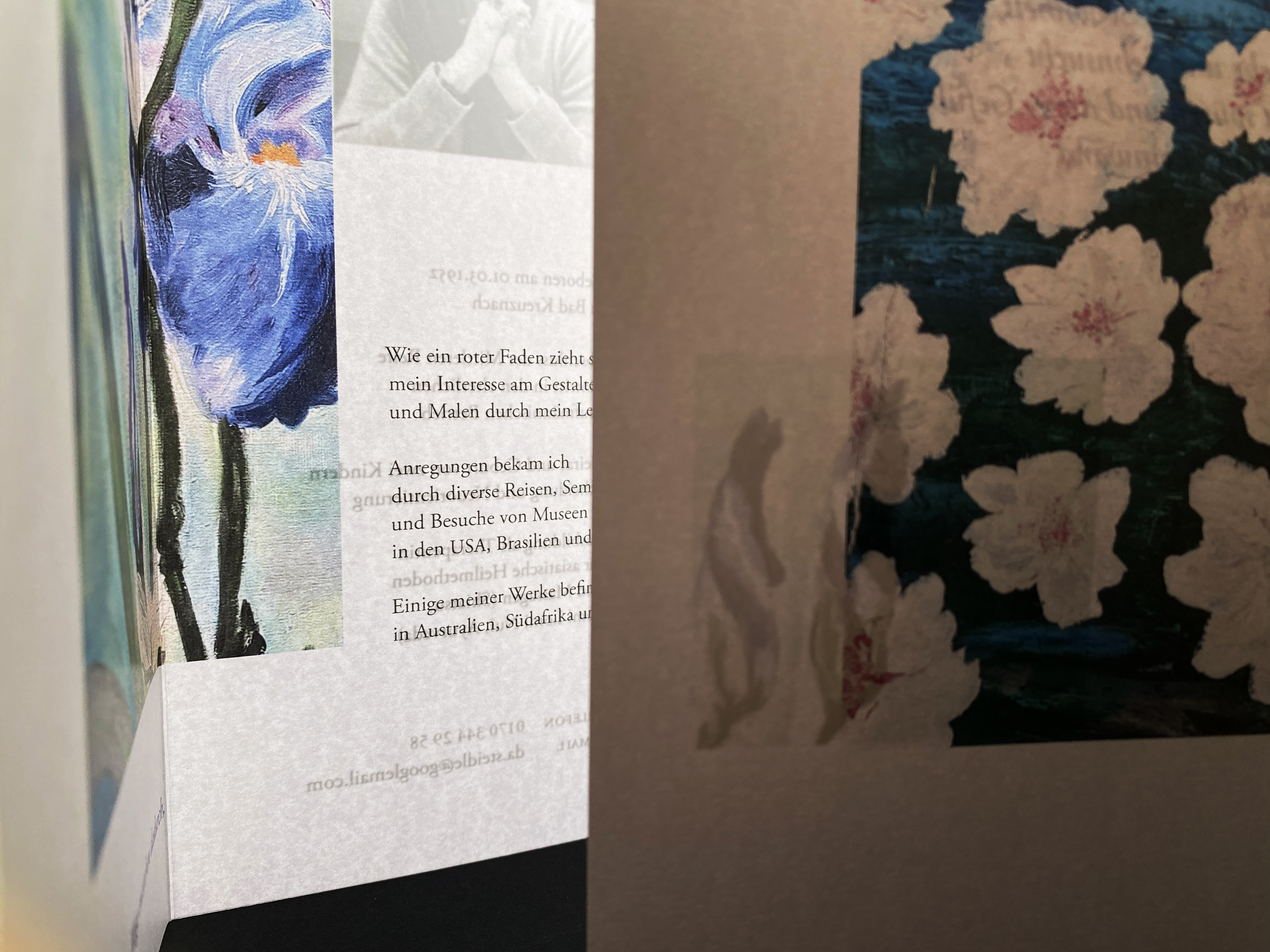
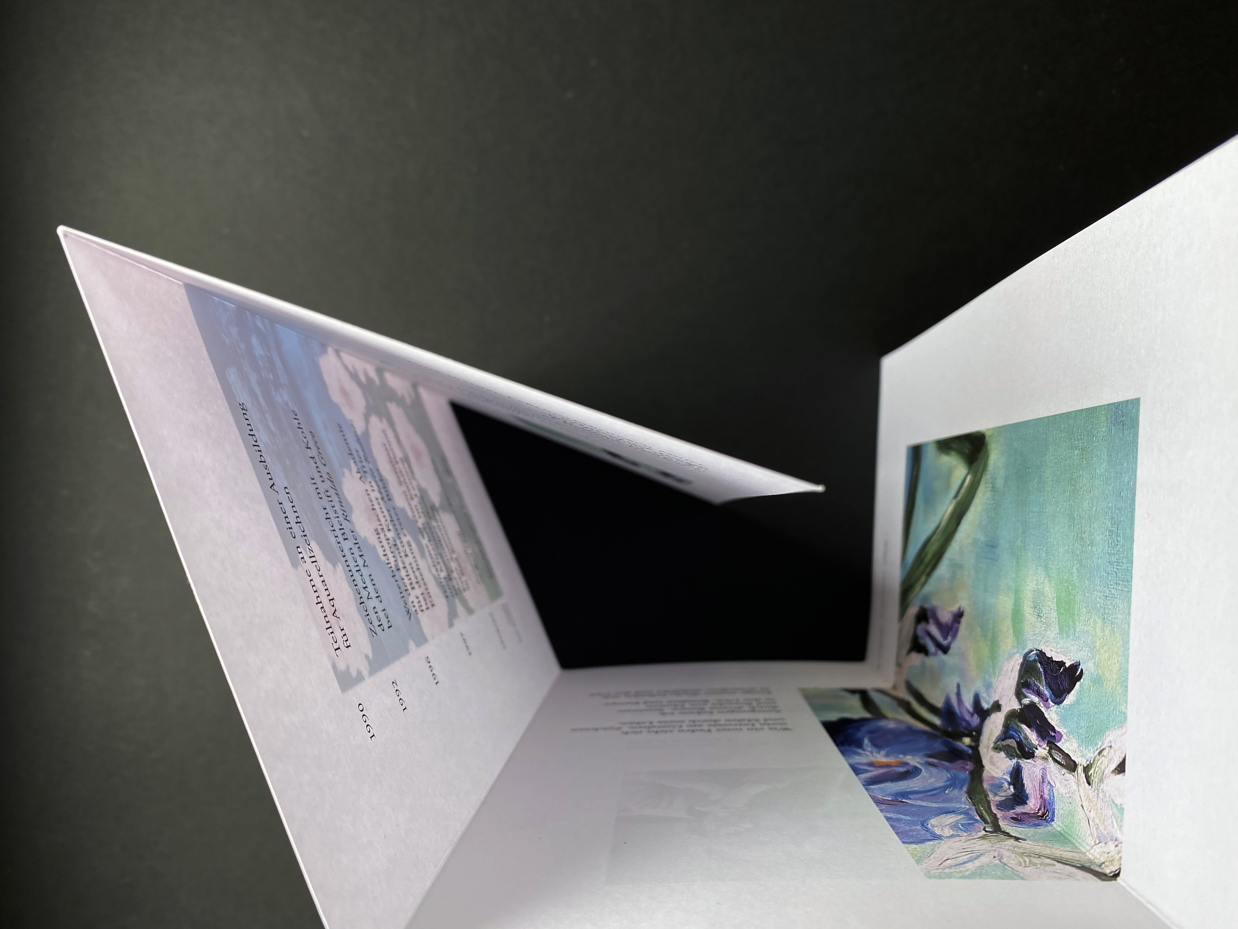
Once the viewer opens the wrap fold further, in its heart there is Mrs. Steidles curriculum vitae, wrapped in her paintings.
To get to know Mrs. Steidle as a creative personality, quotes become an essential factor in the design of the flyer. Her passion for what she does is located in the heart of the flyer, as well as one of her life experiences:
"Painting is to me like being able to capture this feeling of inner beauty, love and longing onto the canvas." and
"Nobody knows what talents may be hidden inside until they try to bring them out."
For this special project — while it was significant to decide on the practical format DINLang — the decision was made to use a high-quality material for the flyer. The chosen paper Original Gmund, Digital Tactile in the colour blanc underlines the characteristics of the painter's work with its smooth surface and soft structure visually and especially haptically, which makes an important difference when it comes to the overall perception of the flyer. Since the focus is on the pictures, it was the material was also chosen on the fact that it would accentuate the images with its vibrant colours in an appealing way.
This flyer was my first project for a private client.
Therefore it taught me how essentially important clear communication at all stages of the project is.
I am thankful to Mrs. Steidle for trusting me with this personal project.