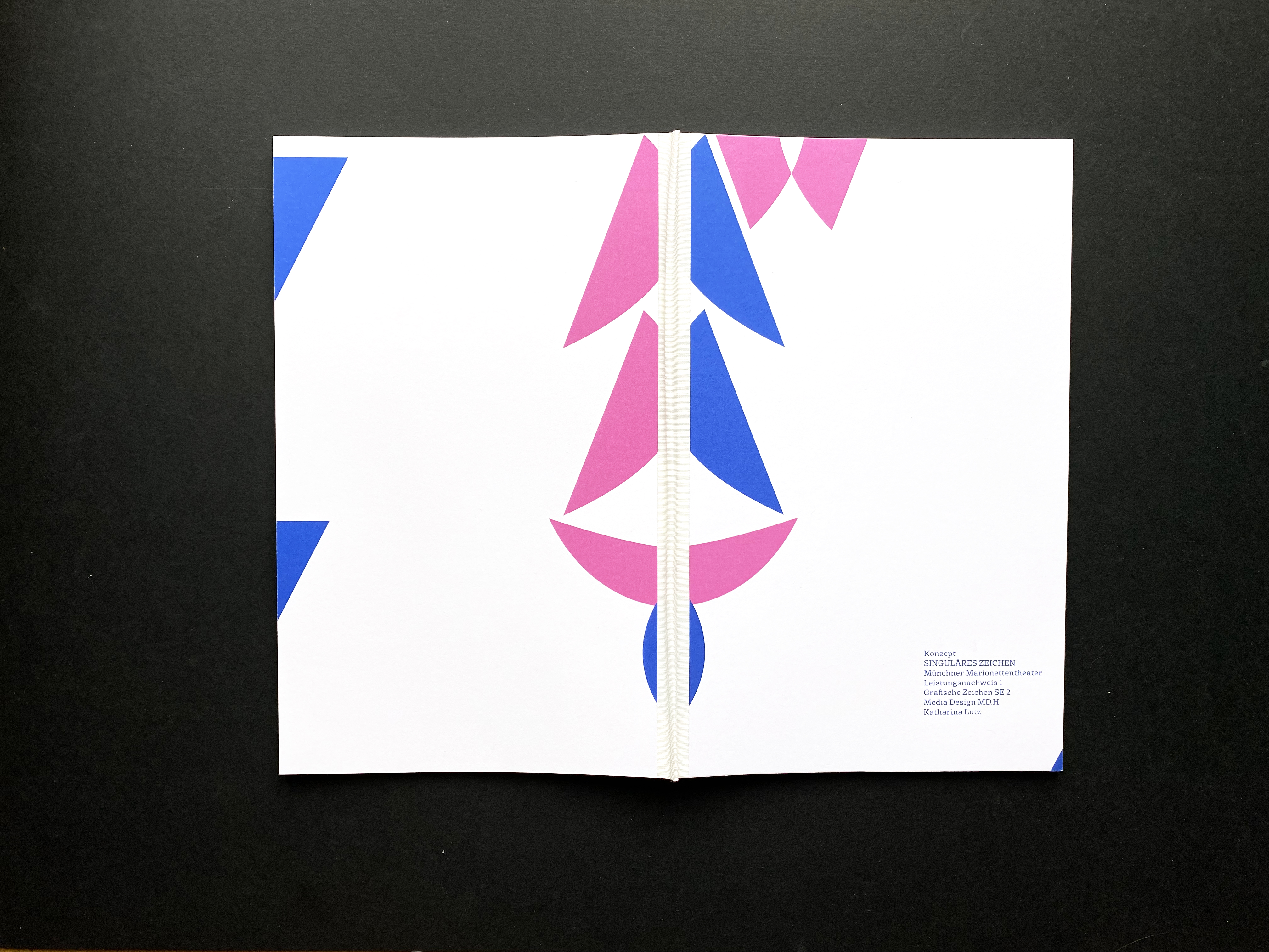
The corporate identity concept for "Münchner Marionettentheater".
The "Münchner Marionettentheater" (puppet theatre of Munich) gets a redesign of its identity, that portrays the theatre with all its values and speaks to its audience.
The puppet theatre of Munich is well known in and around Munich for its long tradition and connection to people. It has a very good reputation and is a cultural asset in its area.
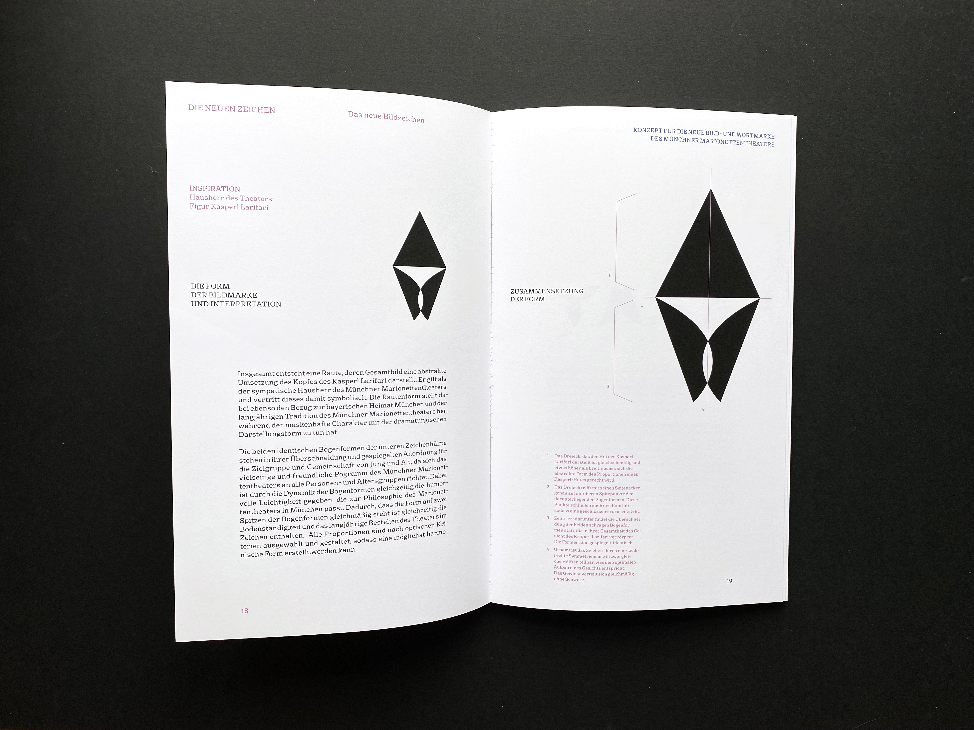
Typical for the Münchner Marionettentheater is the puppet and mascot Kasperl Larifari who is a figure that is original to the theatre and plays the role of the main host and story teller.
This figure is therefore immediately associated with the theatre and very likeable to children and adults.
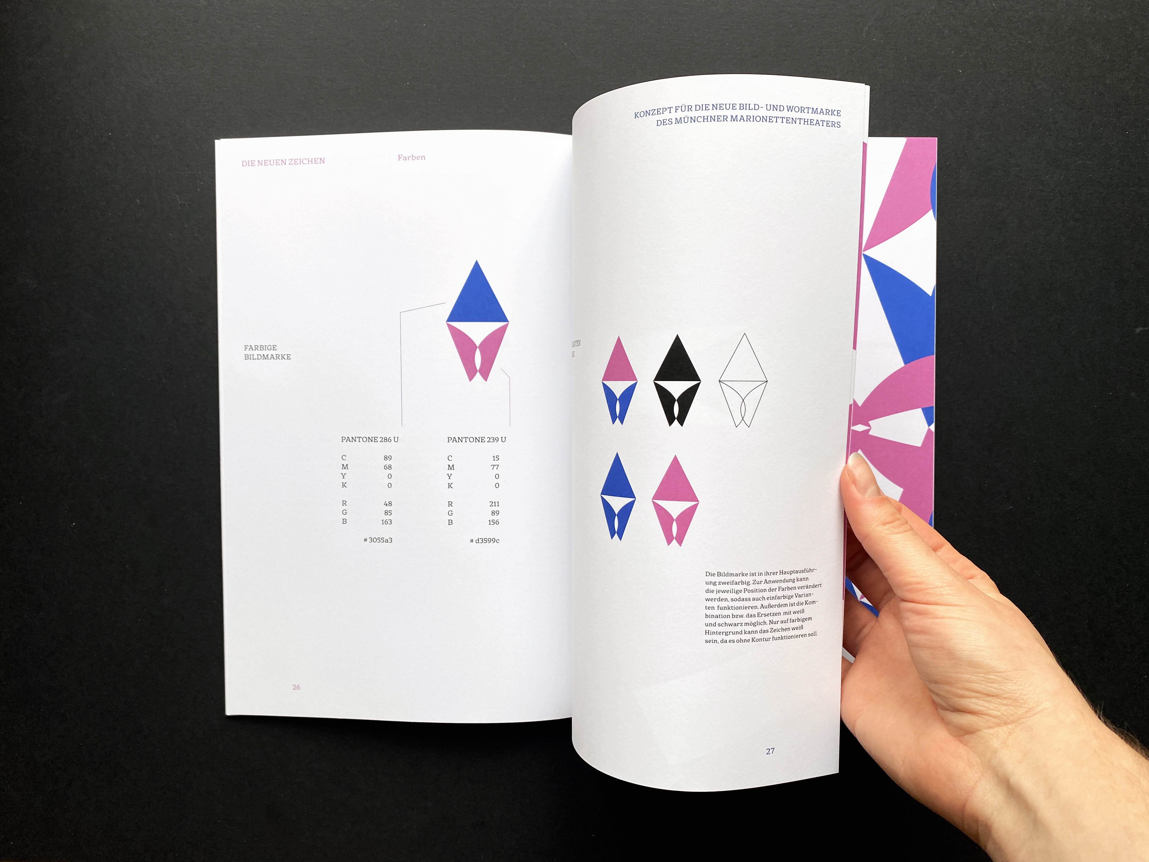
To build a solid connection the new Logo of the puppet theatre is created with the figure "Kasperl Larifari" in mind. The abstract form, which connects to Bavarian tradition with its overall rhombic form as well, is supposed to be an abstract visualization of the mascots face and hat.
It is meant to show a joyful character by standing on the tips of its base forms, as humour is very important to the theatre's plays.
The symmetrical rounded forms which overlap, can be viewed as a personnification of the two groups in the audience: Young and old. Both age groups are welcome in the "Münchener Marionettentheater" equally.
Both rounded forms can also be symbolic for the audience and the actors, since a theatre is dependent on both. They connect and demonstrate the easygoing atmosphere and harmonizing communication between actors and visitors.
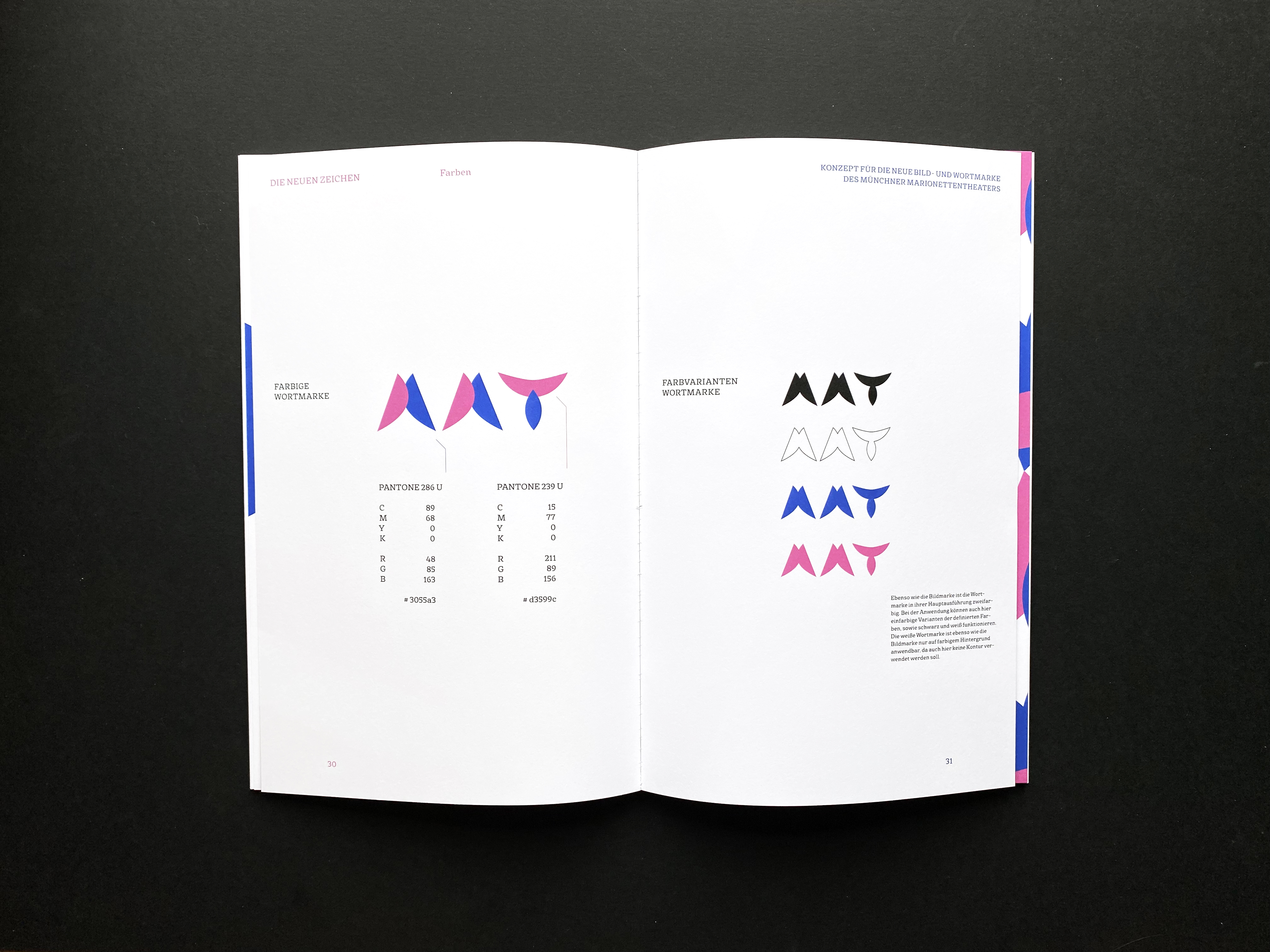
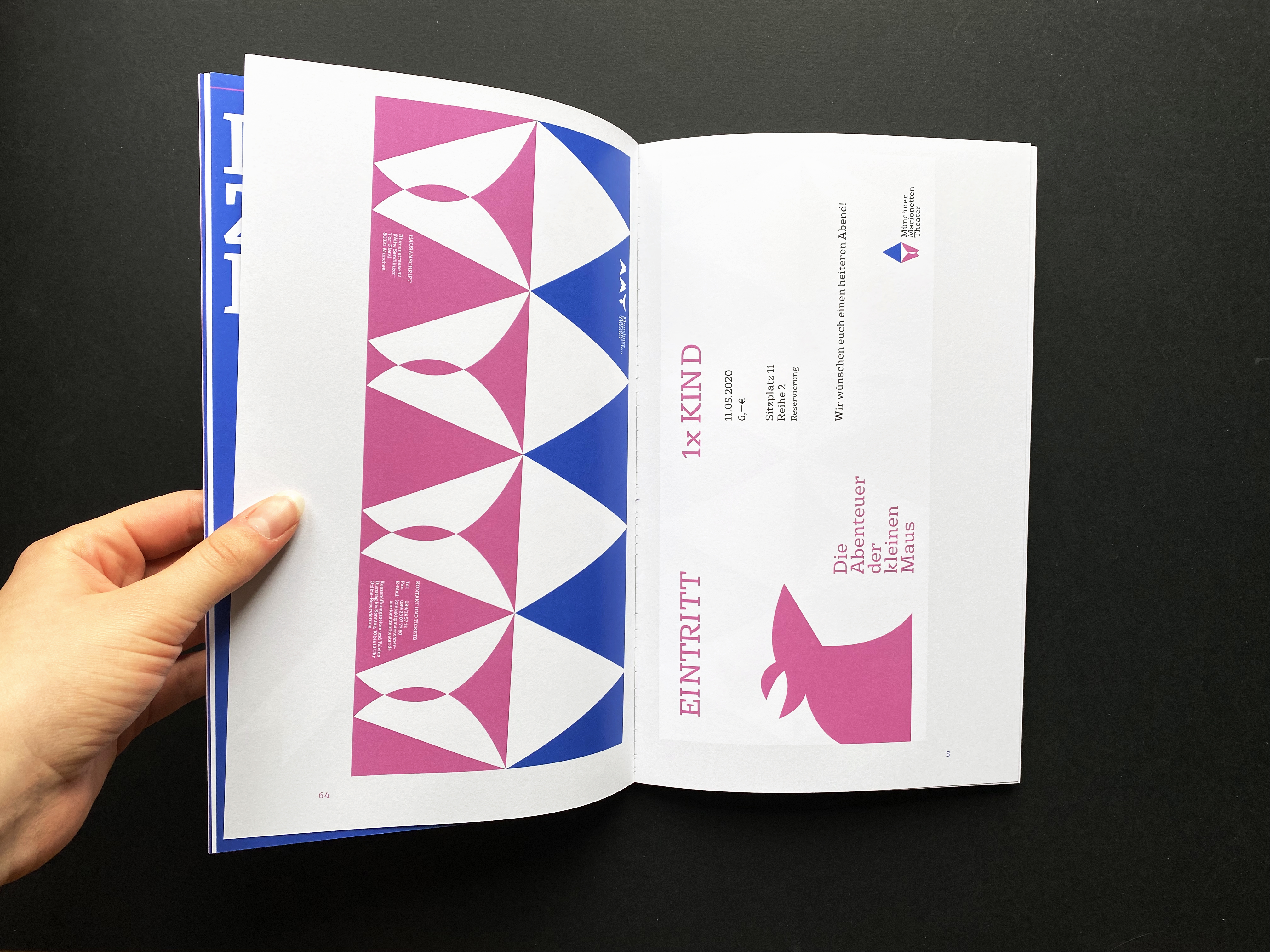
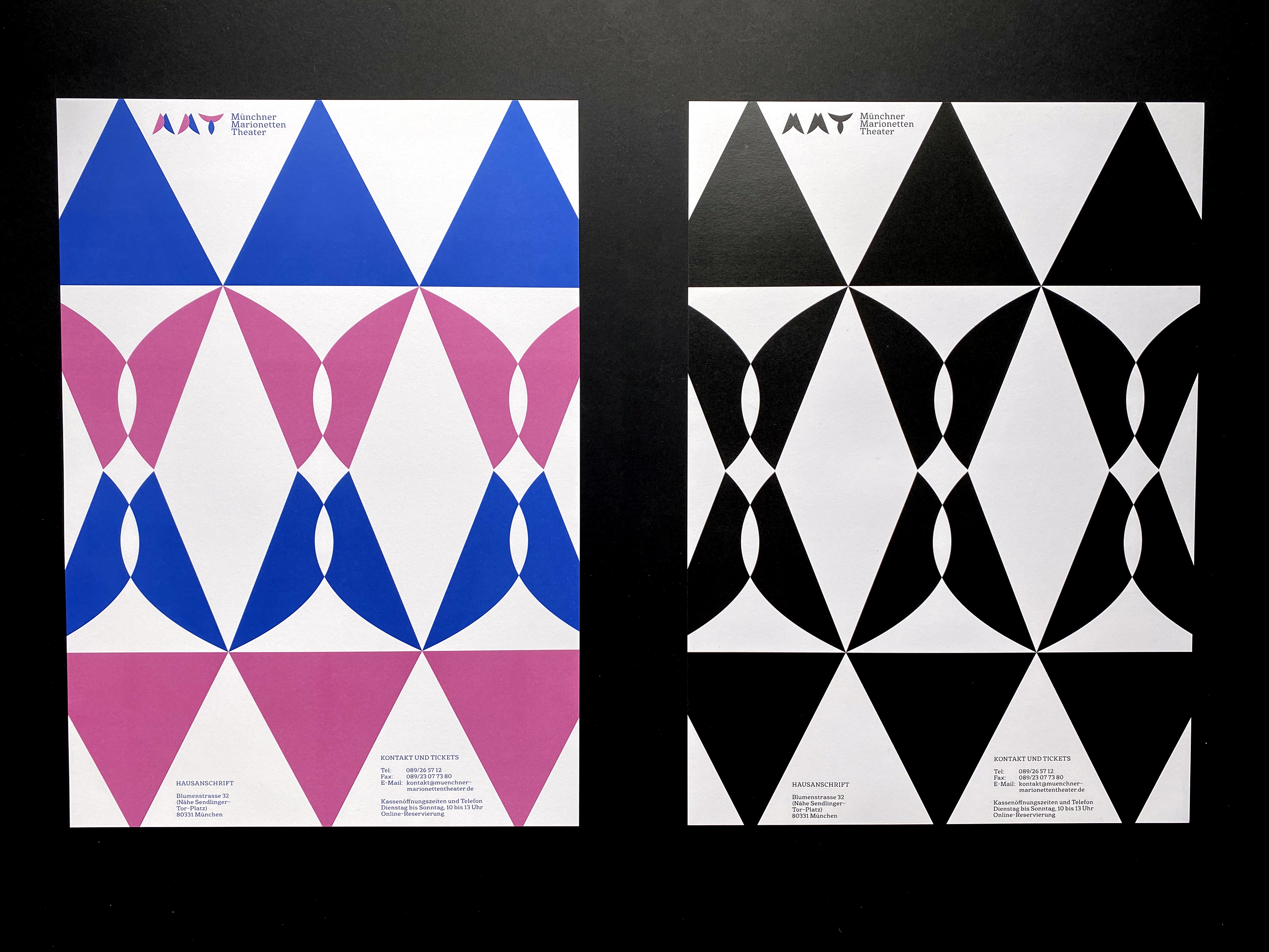
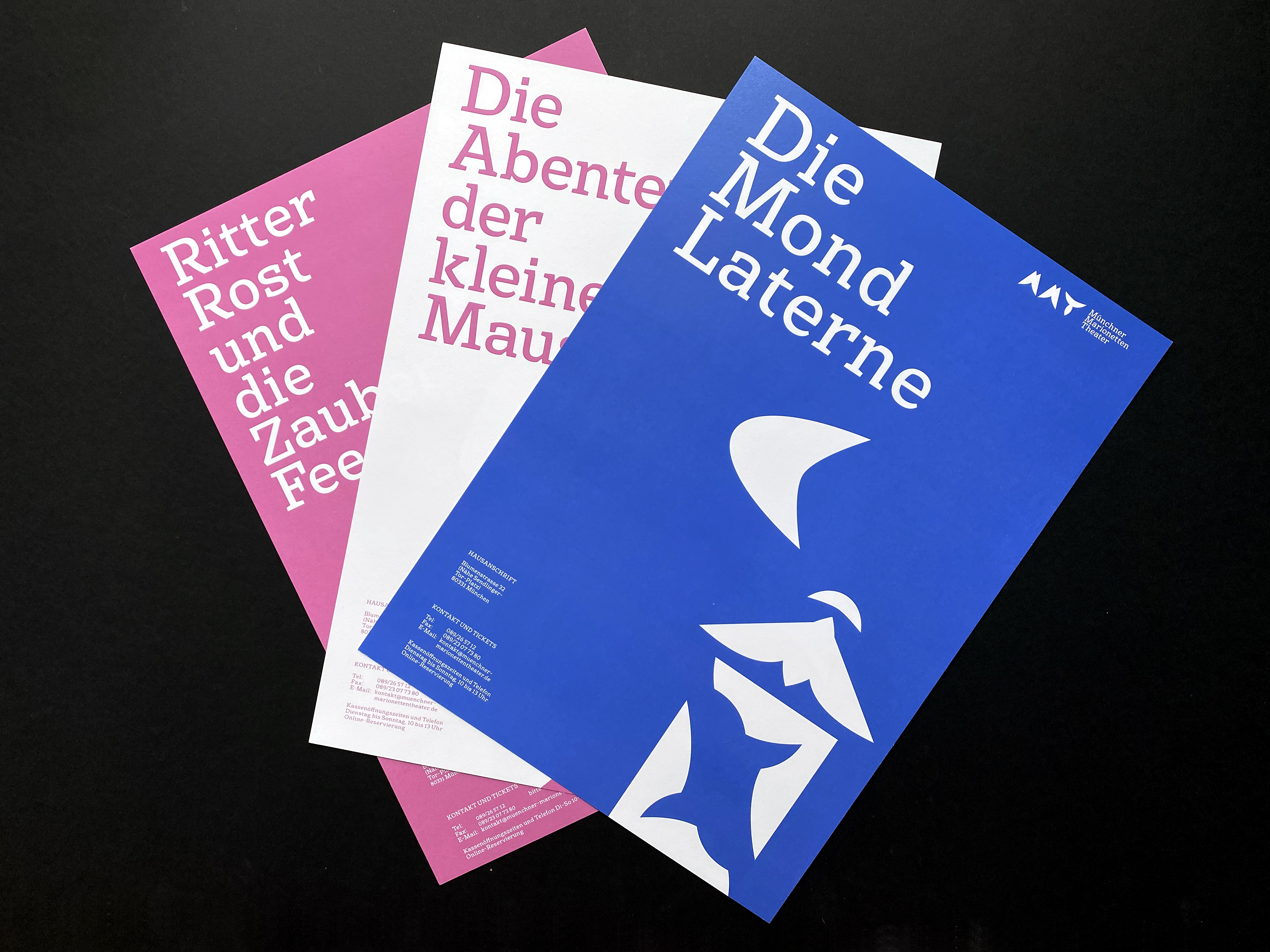
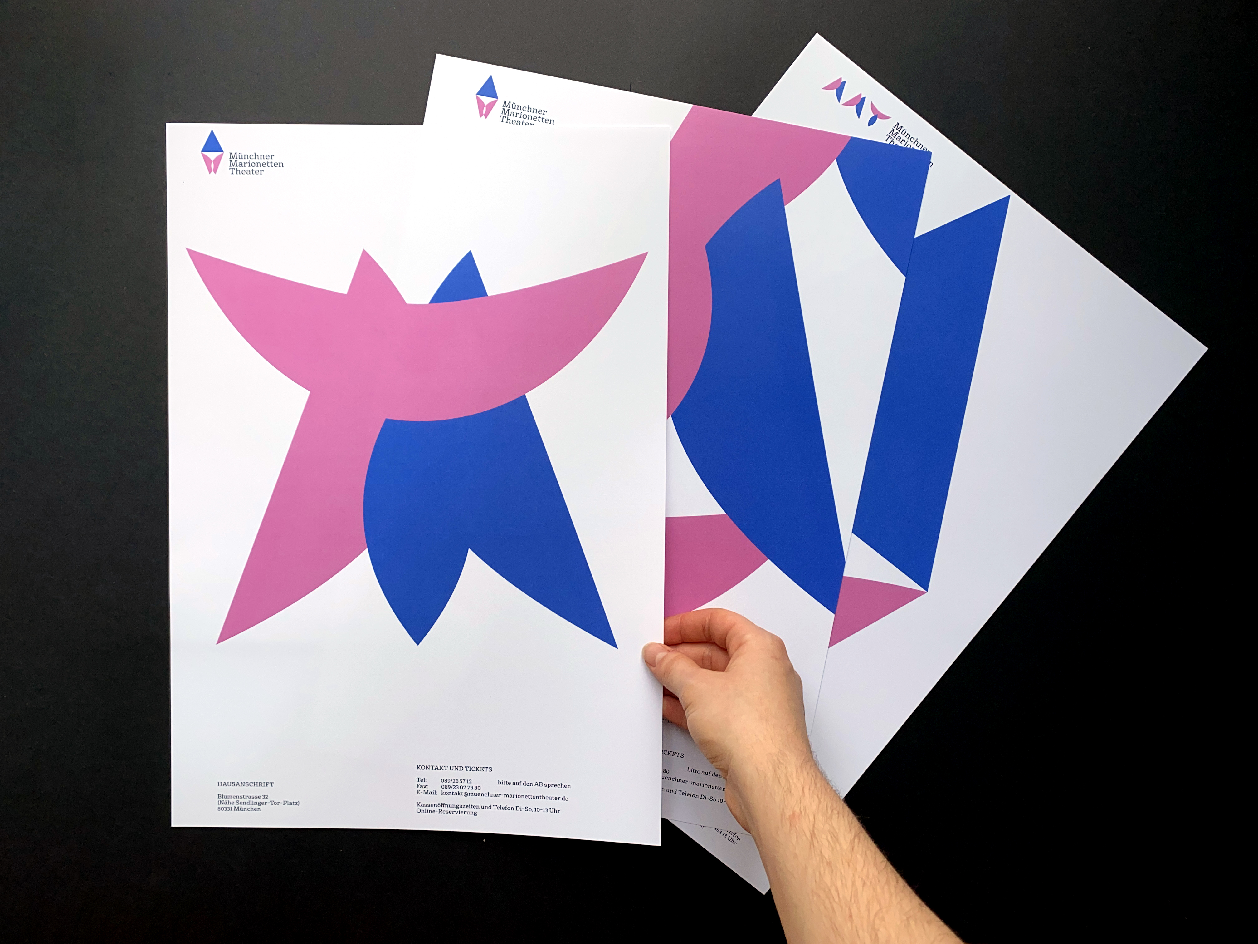
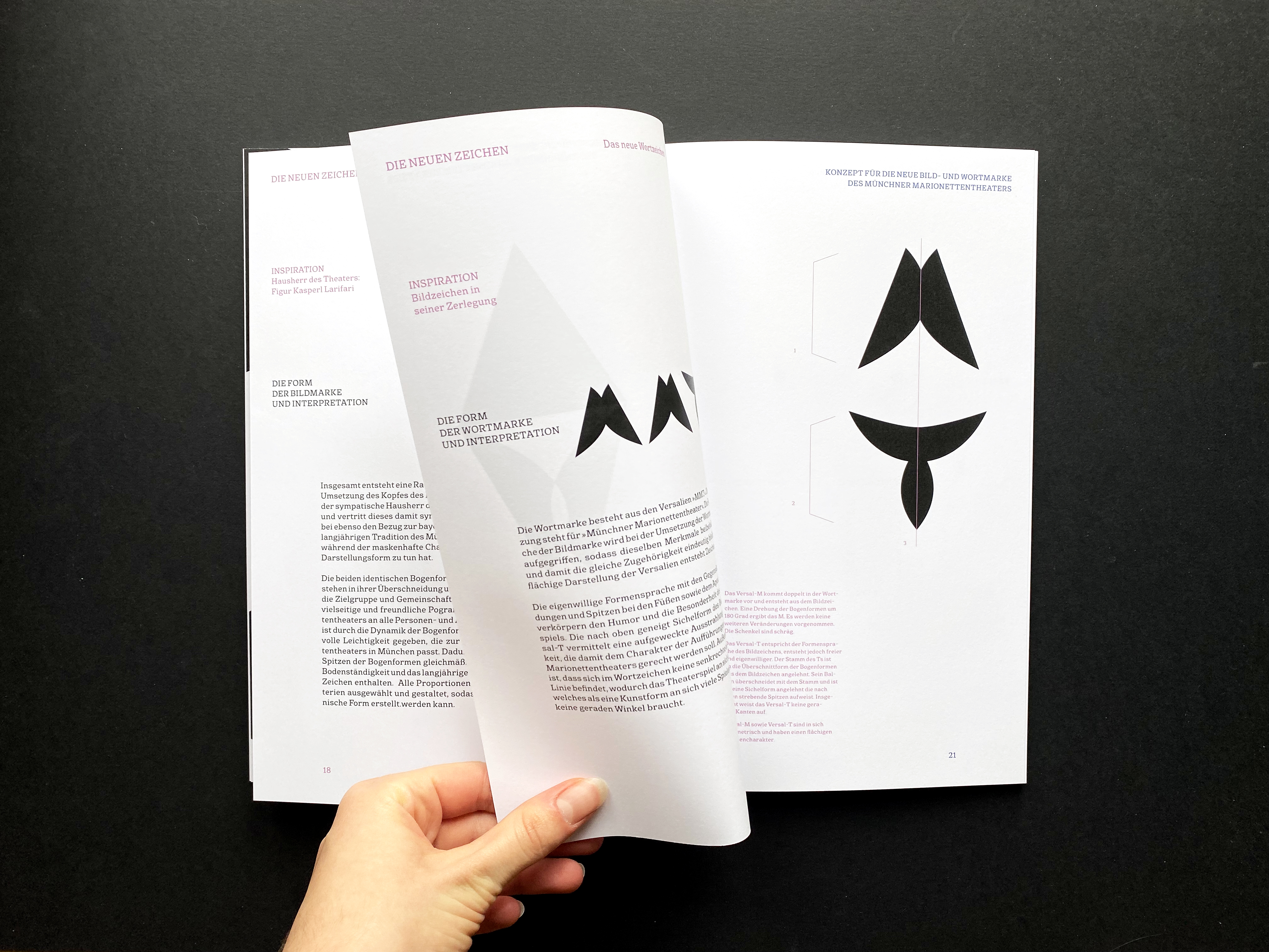
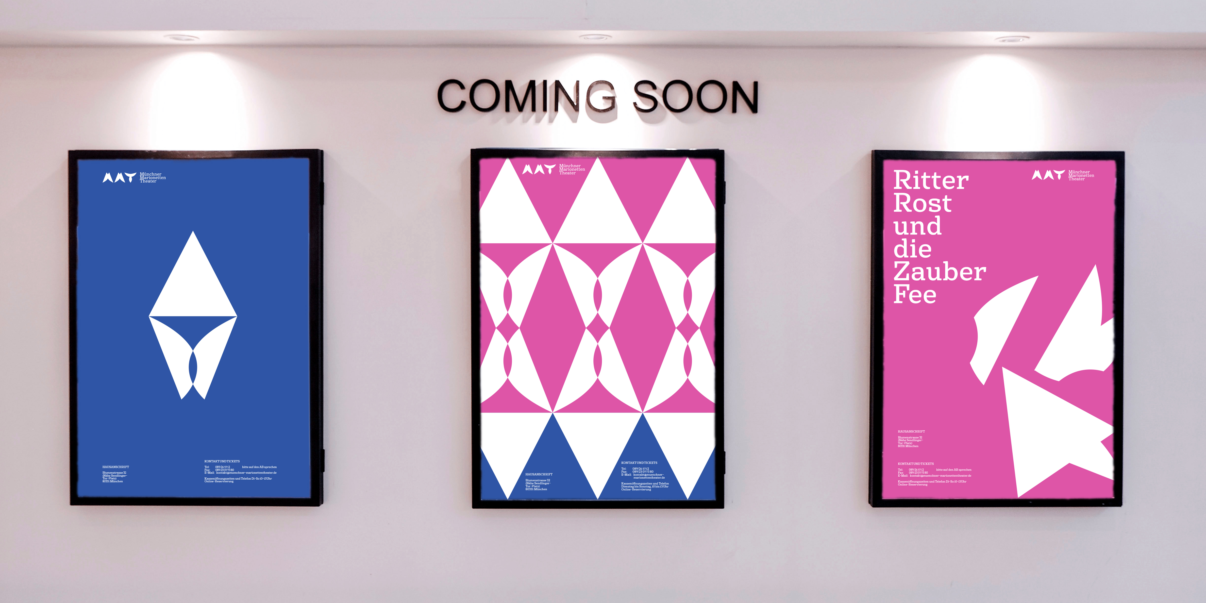
Additionally, a second logo that is made up of the same or similary shaped forms as the figurative mark is created. The letters MMT, which are the initials of the Münchner Marionettentheater, are encorporated in the same lively and witful shapes to keep the same vibrations.
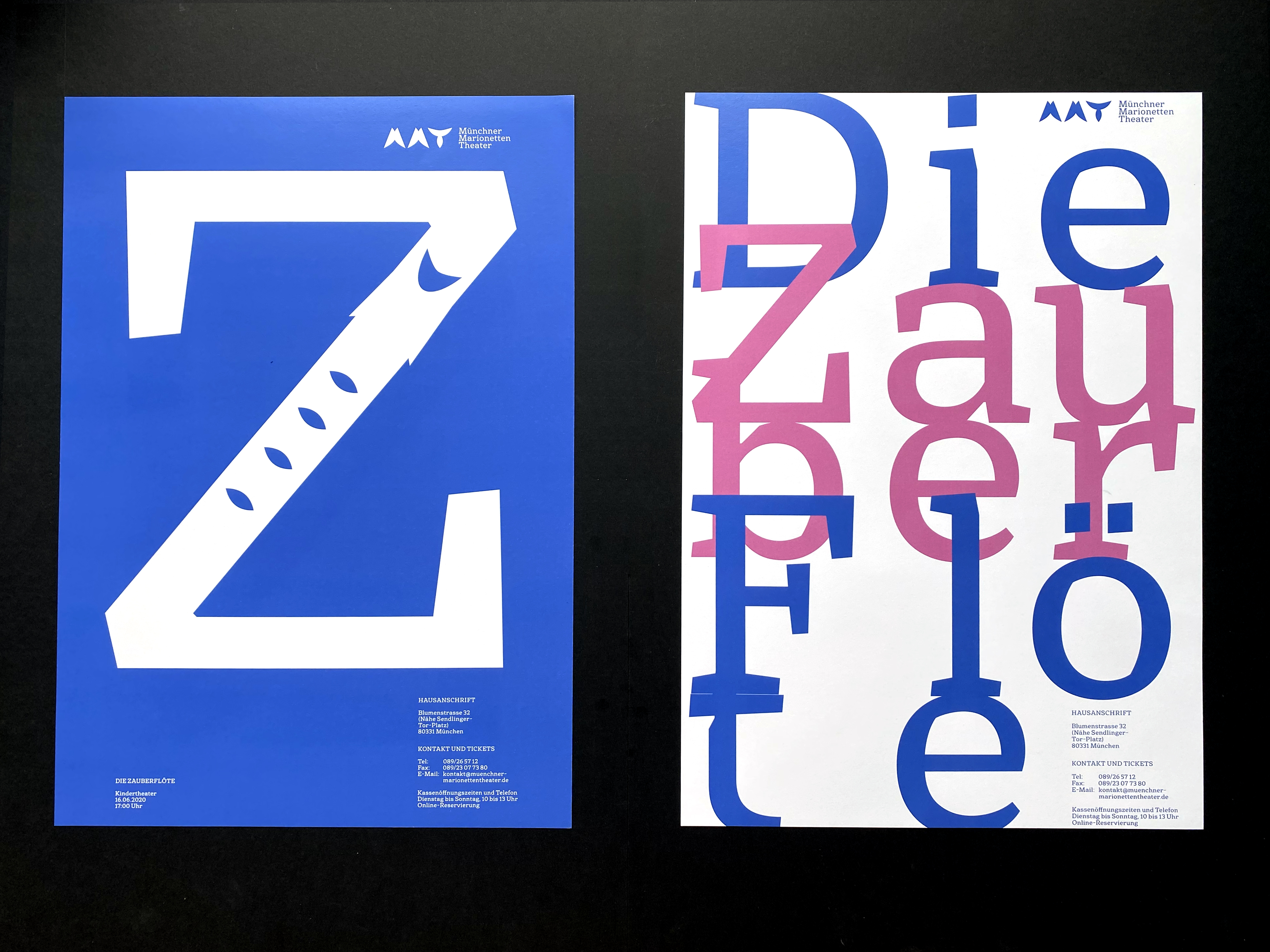
The typeface chosen for the new identity is Basil. This typeface emphasizes the traditional and happy characteristics through its strong serifs while helping with connecting the abstract symbols to people as humans.
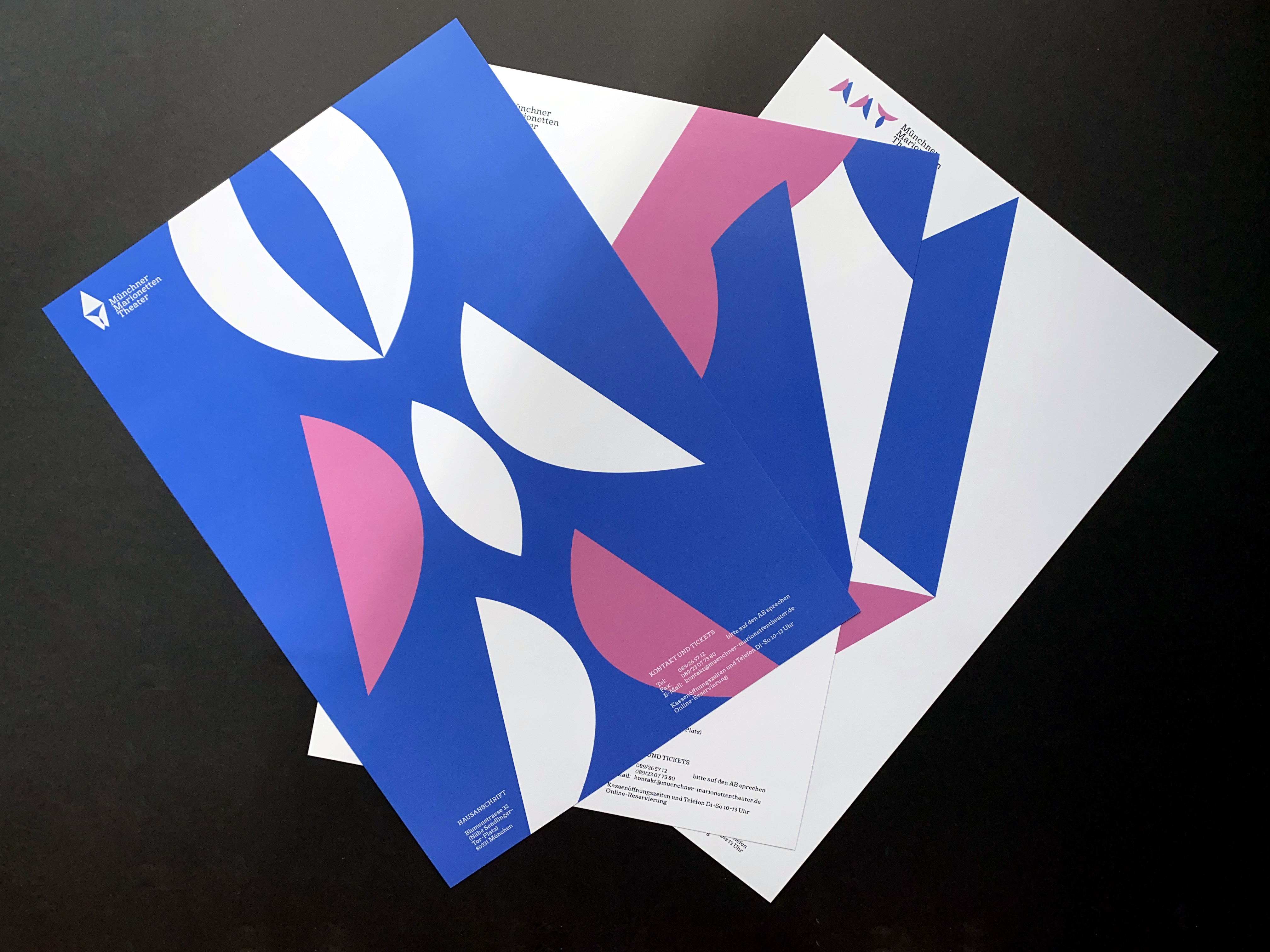
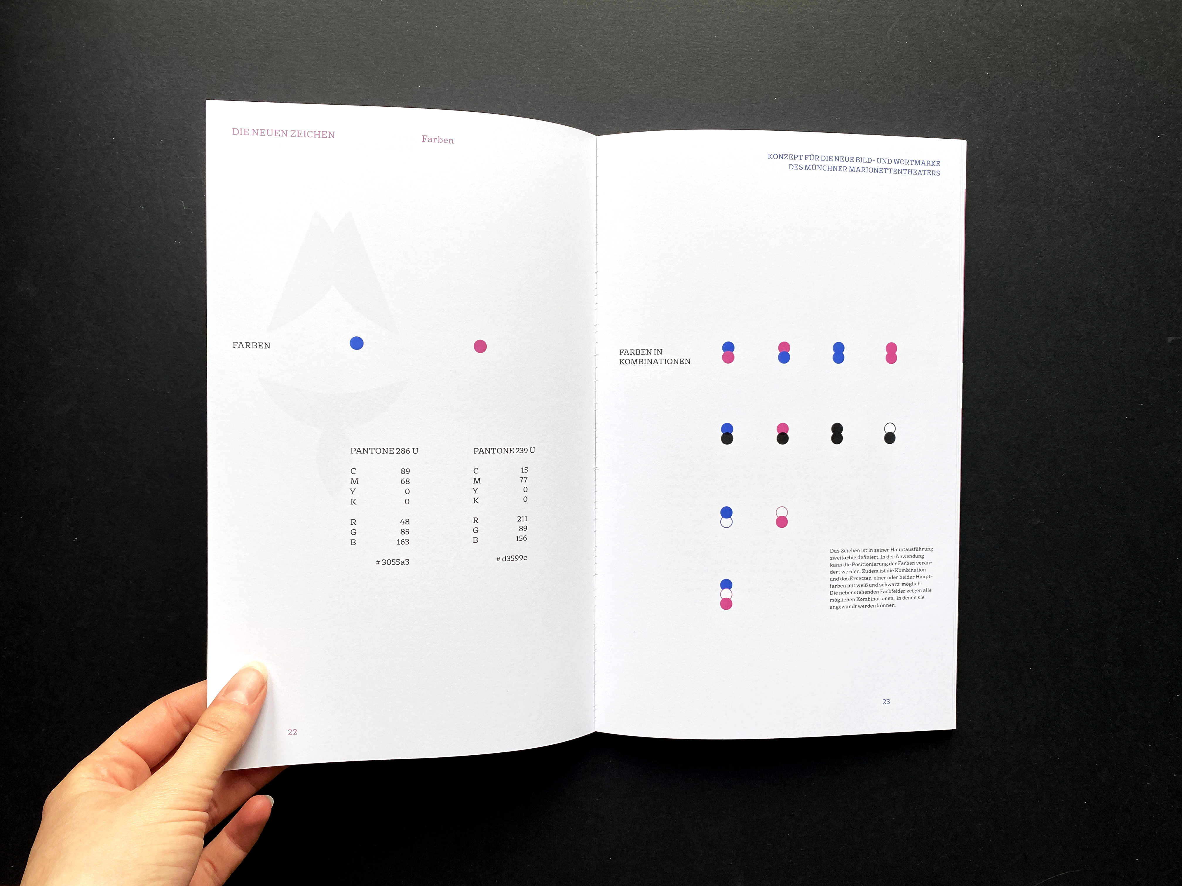
When it comes to colour. The Münchner Marionettentheater comes to live through two playful and neutral colours that can be described as soft pink and a darker violet blue. The colours are supposed to symbolize the topics of many plays shown which are usually fairy tales and fantasy operas.
Applications can use the specified colours as well as black and white. They can help in distinguishing children's tickets from adult's for example.
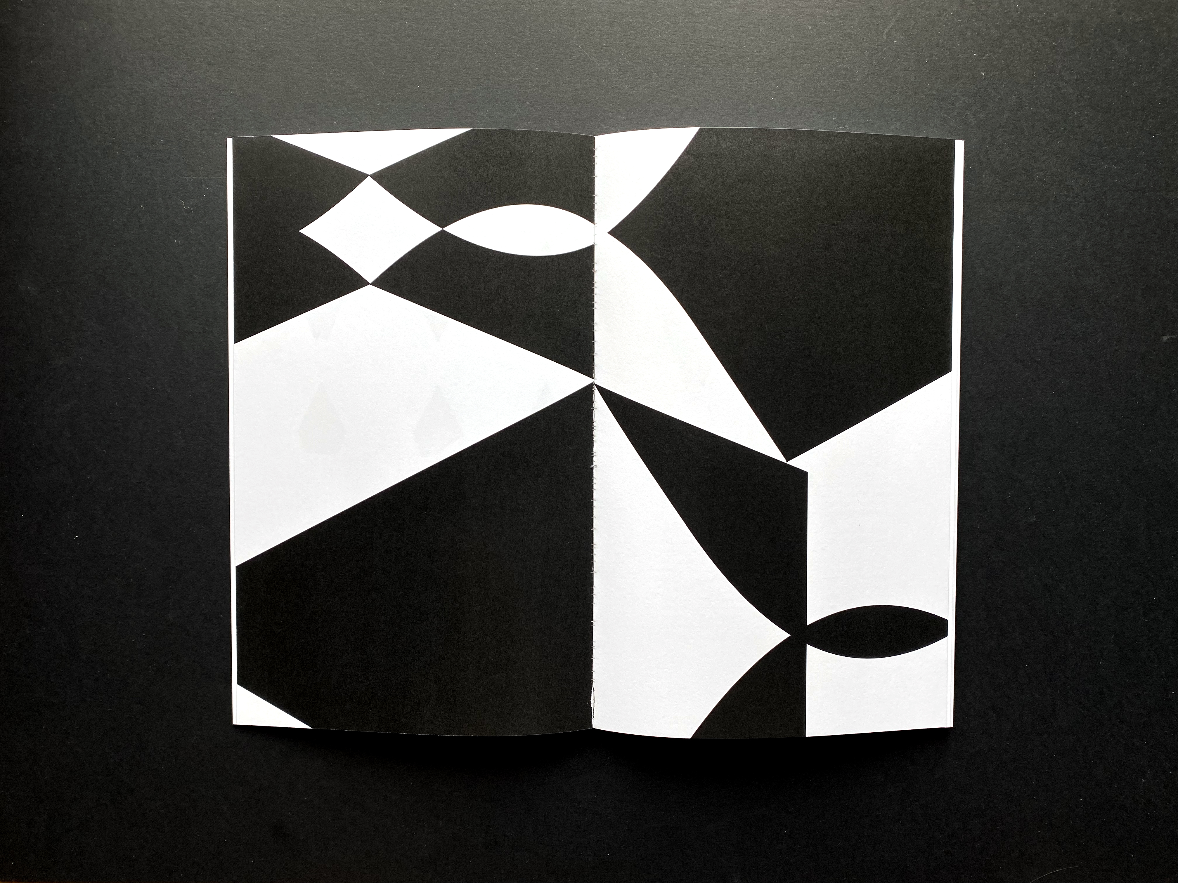
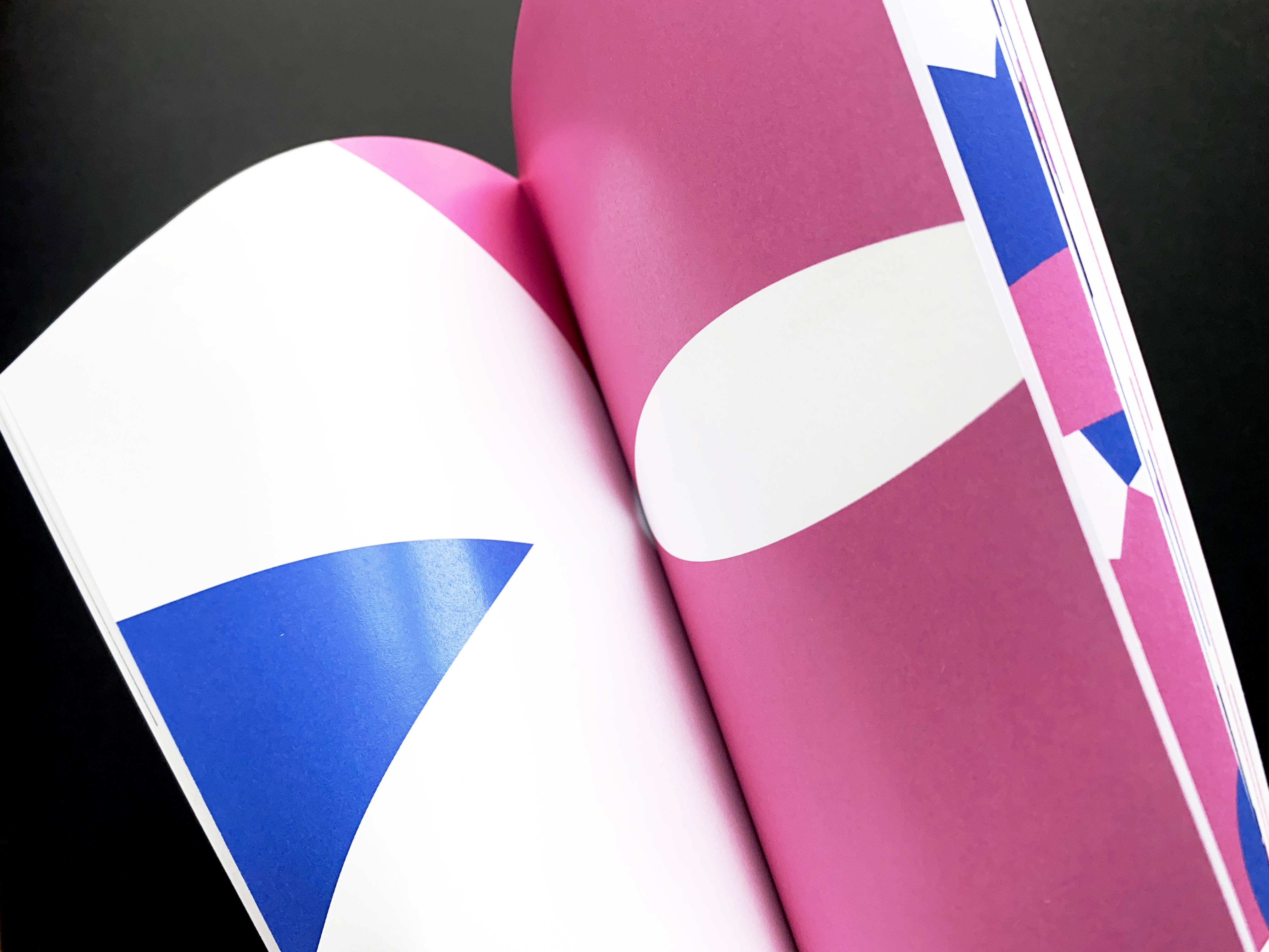
In general, the colours can be combined in posters. The newly created form language can be used to create abstract forms for posters and advertisement. By arranging the forms in different ways figures can be created in a playful way. It is also possible to play with the depiciton of logo and symbol.
This corporate identity was a fictional solo project.